(This essay is adapted from an On the Issues program with Craig Gilbert, Mike Gousha, and John Johnson. Click here to view that program in its entirety.)
Wisconsin has a confusing political personality. A casual observer might perceive it as a blue state. After all, 2016 is the only year a Democratic presidential candidate lost the state since 1984. On the other hand, it feels very purple when you consider that Barack Obama is the only presidential candidate since Michael Dukakis to win an outright majority of the vote. In still more ways, you might think this is a solidly red state. Republicans have controlled the State Assembly for all but three years of my lifetime. Rather than encouraging a mood of bipartisanship, I think this combination of red and blue traits leads many Republicans and Democrats alike to believe that they are the “true” representatives of Wisconsin who are only stymied by the illegitimate interference of the other party.
My preferred description is that Wisconsin, politically speaking, is not one moderate state; rather, it is one very conservative state overlapping another very liberal one. This state of affairs, after all, isn’t new. Wisconsin gave the nation the rabid anti-communist senator Joseph McCarthy at the same time Milwaukee elected its third mayor from the Socialist Party. The varied nature of Democratic and Republican coalitions in Wisconsin—both geographically and demographically—gives each party advantages in certain kinds of elections. Republicans have long performed better in the state legislature than their statewide vote share would suggest. This advantage accelerated after the 2011 redistricting, by some measures doubling their previous advantage. But how much of the built-in Republican advantage in the State Assembly is due to deliberate partisan gerrymandering and to what extent it is the natural consequence of Wisconsin’s political geography?
There is a story I often hear about Wisconsin politics that goes something like this. “Wisconsin is narrowly divided between Democrats and Republicans. Democrats are more likely to win when turnout is high because they have an advantage with lower-propensity voters. Even though Democrats can often win a small majority (or at least plurality) of Wisconsin voters statewide, they fail to win control of the legislature because Republicans drew the map in a gerrymander so successful that Democratic success is virtually impossible.”
Not all of this story is borne out by the evidence. In the past, it is true, Democrats held an advantage in party identification, while Republicans were more likely to show up. Republicans could expect to do better in lower turnout elections for governor, but Democrats could count on a boost during marquee presidential races.
This isn’t the case anymore. From 2012 through 2016, Wisconsin Democrats enjoyed a stable 4-point advantage in party identification. After Trump’s election that changed. Now, Republicans outnumber Democrats by one percentage point of the state’s total electorate. This change was driven by a 13-point shift among non-college educated Wisconsin men toward the Republicans. From 2012 to 2020 the share of Republicans with at least a bachelor’s degree declined from 37% to 32%. The share of Democrats with at least a bachelor’s degree grew from 36% to 41%.[i]
More educated people are, of course, more likely to vote. The average Democrat is still younger and poorer than the average Republican, two factors which decrease the likelihood of voting. But the shift in each party’s educational composition has evened the odds that each party’s members will vote, particularly in gubernatorial elections. Across all 2014 polling, Republicans were 6 points more likely to be likely voters than Democrats. In 2018, they were one point less likely to be so than Democrats. The fact that Democratic candidates performed better in 2018 than 2020 (despite 14% more of the state’s eligible voters participating) may be a sign of the future.
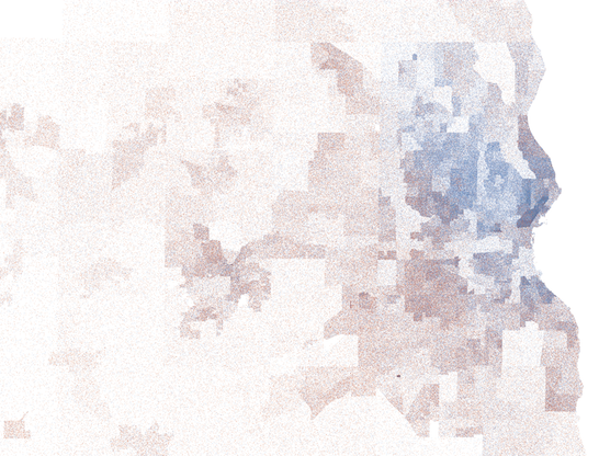
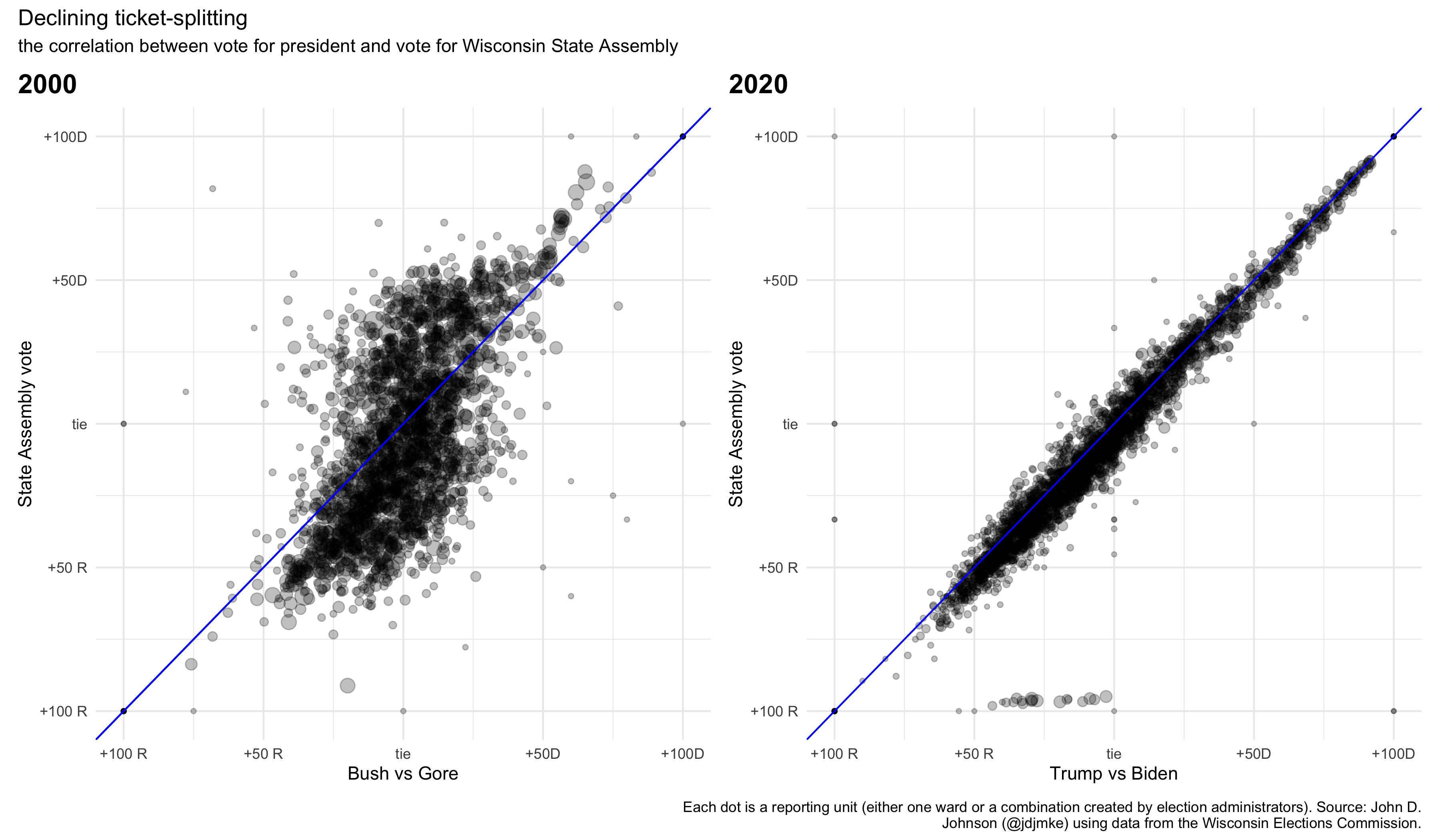
These changes in party identification have contributed to the state’s increasing asymmetrical polarization. It’s not that Wisconsin is splitting into half very red and half very blue places. It’s that Wisconsin’s Democrats are increasingly concentrated in very blue communities in a way that Republicans simply aren’t. At the same time, the behavior of individual voters has become much more predictable. Consider the graphs below, which compare the vote split in the presidential race with Assembly races. In 2000, the Assembly vote and presidential vote had a correlation coefficient of 0.61 (where 1 is perfectly correlated and 0 is totally unrelated). By 2020, the coefficient reached 0.95. This political geography has serious implications for any effort to draw fair political districts.
Partisan gerrymandering works by diluting the influence of one party’s votes through a combination of strategies called “packing” and “cracking,” each of which assumes that you can guess how people will vote based on where they live. Cracking is when an opposing party’s voters are spread out across several districts so that they form a perpetual minority in each one. Packing is when voters from the target party are placed in as few districts as possible, limiting the number of seats they can influence. These two strategies work in tandem. You pack some voters so you can crack the rest.
A large and growing number of Democrats in Wisconsin are self-packed into urban areas. Wisconsin law mandates that legislative maps avoid crossing county and municipal boundaries where practical. Federal law requires that a certain number of majority Black and majority Latino districts be drawn as well. All of this means that virtually any process of redistricting will create a set of heavily blue urban seats “packed” with Democrats, leaving us with the question, how much of the Democratic party’s current disadvantage in Assembly races is “naturally” occurring and how much is due to the schemes of Republican mapmakers?
Simple measures of partisan bias can be inaccurate or inconclusive. For example, we can’t just compare the number of votes cast statewide for Democratic or Republican Assembly candidates. Democratic candidates received 53% of total Assembly votes in 2018, but they also contested 91 races compared to just 69 for Republicans.
Over the past decade, mathematicians and quantitative social scientists have developed a set of sophisticated methods for measuring the partisan bias of maps. One popular technique is to algorithmically draw a huge number of random maps, all of which meet the criteria of being compact, contiguous, and consistent with federal civil rights requirements. Then, they divide existing election data up into those hypothetical random districts. With enough of these maps, a clear distribution of “normal” outcomes emerges.
No matter the technique used, every examination of Wisconsin’s State Assembly map reveals a remarkable gerrymander. A group of professors from Duke University created over 19,000 random Assembly maps. They found, “that the Wisconsin redistricting plan is highly gerrymandered . . . and shows more Republican bias than over 99% of the plans.”[ii]
Jowei Chen, a political scientist from the University of Michigan, performed a similar study specifically measuring the “efficiency gap” under alternative district schemes.[iii] The efficiency gap is a measure of how many votes for one party are “wasted” compared to the other party. A vote is “wasted” if it is cast for a losing candidate, or if it is cast for a candidate who already has enough votes to win their race. In a fair map, the reasoning goes, close to the same number of Democratic and Republican votes will be “wasted.”
Chen’s research found, “Wisconsin’s natural political geography, combined with a nonpartisan process following traditional districting principles, could plausibly produce a plan with a modest amount of Republican-favoring electoral bias.” But, critically, “These levels of natural electoral bias pale in comparison to the much more extreme electoral bias exhibited by the Act 43 plan [enacted by Republican legislators in 2011]. The Act 43 plan exhibits a Republican-favoring efficiency gap several times that of most simulated plans, and over twice as large as even the most biased of the 200 plans produced by the nonpartisan computer simulation process.” In other words, the existing Republican gerrymander is laughably unlikely to occur unintentionally.
The simplest way to show this is just to compare the results from the districts drawn in 2011 with those used from 2002-2010. In 2012, Obama won 53% of the statewide vote. He won more votes than Romney in 55 of the Assembly districts used in the previous decade, but he only beat Romney in 43 of the newly drawn Assembly districts.
There is no serious question that the State Assembly districts drawn in 2011 are an extreme Republican gerrymander. However, that fact does not establish how much better Democrats could have done under a fairer map.
When Republicans are already winning, the gerrymander has little added value. Scott Walker won 52% of the statewide vote in his 2014 reelection. This was good enough to beat Mary Burke in 64 Assembly districts. He would have also beat Burke in 63 of the previous decade’s districts, and 62 hypothetical districts drawn to be as compact as possible. Likewise, Donald Trump’s narrow statewide victory in 2016 defeated Clinton in 63 of the actual districts, 58 of the old districts, and 61 of the maximally compact districts.
The gerrymander only shows its teeth when Democrats do well statewide. When Tony Evers won the statewide vote in 2018, he still lost to Scott Walker in 63 Assembly districts. Under the previous decade’s map, Walker would have only “won” 53 seats. This statistic is telling for two reasons.
First, it shows the strength of the 2011 gerrymander. Walker’s strong 2014 performance carried 65 districts—about the same as would’ve occurred under the old, court-drawn map. A six-point victory or a 1-point loss statewide (as in 2014 and 2018, respectively) made practically no difference at all in the Republican Assembly majority.
Second, it shows the extent to which Wisconsin’s political geography stacks the deck against Democrats, even in the absence of deliberate gerrymandering. Under the old district map, Tony Evers’ 1-point victory still only carried 46 seats. Republicans would have still held a 7-seat majority.
I broke down the results of every November presidential and gubernatorial election since 2002 into three Assembly district schemes—the current 2011 map, the map drawn by a federal court in 2002, and a set of districts algorithmically generated to be as compact as possible.[iv] Out of all 10 of these elections, the 2012 presidential contest is the only time that majority control of the Assembly varied between the schemes. Obama won 55 seats to Romney’s 44 in both the 2002 and maximally compact maps. In reality, Walker carried a majority of the vote in 56 of the just-drawn Assembly districts.
But even this split is not as clear as it seems. Obama was considerably more popular than just about any other Democrat. In 2008, he won 56% of the vote statewide, beating John McCain in 76 of the then-current Assembly districts. Actual Democratic candidates only won 52 of those races.
We can’t directly compare election results using actual votes for Assembly seats because so many of these races aren’t contested by both parties. Three professors (Herschlag et al.) from Duke University offered a solution to this problem in their paper “Evaluating Partisan Gerrymandering in Wisconsin.” They interpolated (i.e. “estimated”) assembly votes for wards without a contested race using a model based on votes for contested statewide and congressional elections
The results of that analysis for the 2012, 2014, and 2016 Assembly elections are in Figure 2.[v] Each histogram shows the distribution of seats won by Republicans in their ensemble of 19,184 random district maps.
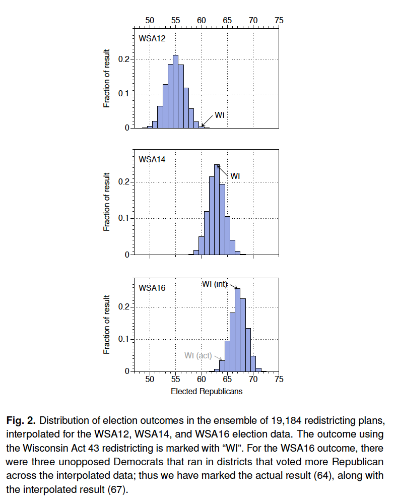
Republicans in 2012 actually won 60 seats. This is a very extreme outcome in the Herschlag model. Their average neutrally-drawn map gave Republicans 55 seats. Based on their simulations, a map that gave Democrats a majority of the Assembly in 2012 would have been just as improbable as the actual Republican gerrymander.
Once again, their simulation demonstrates that the Republican gerrymander ceases to gain Republicans more seats once they win a majority statewide. In 2014, the number of seats actually won by Republicans corresponds exactly with the average result in their ensemble of nonpartisan maps. In 2016, Republicans actually won three fewer seats than expected because they failed to run candidates in three perceived “safe” Democratic districts which Donald Trump unexpectedly won.
The main effect of the 2011 gerrymander was to make fewer districts competitive. Even more Democrats were packed into extremely Democratic districts and most of the remaining Democrats were strewn (or “cracked”) across a range of strongly, but not absurdly, Republican districts. Very few “swing” districts remained. If more competitive districts had remained, it’s possible that Democrats would’ve fielded stronger candidates and funded better campaigns. This counterfactual could complicate analysis by Herschlag. A more competitive district map might actually improve the performance of down ballot Democrats relative to their top-of-the-ticket standard bearers.
The gerrymandered map drawn in 2011 probably hasn’t cost the Democrats control of the Assembly in any election this decade, with the possible exception of 2012. Nonetheless, it has inflated the Republican majority in the close elections of 2012, 2018, and 2020, and in each election, it has cheated many Wisconsinites out of real competition for their votes. Under the districts drawn in 2011, only 15% of Wisconsin residents live in an Assembly district that typically decides elections by single digits.[vi] If the previous map were still used, 21% would.
This gap is less than I expected. It means that even under a non-partisan redistricting scheme, a large majority of people would still live in a non-competitive neighborhood. This points to some basic changes in Wisconsin’s political geography over the past two decades.
The image below compares the neighborhoods where Democratic and Republican voters lived in the 2000 and 2020 presidential elections. The comparison is apt because each race resulted in a razor-thin Democratic victory—functionally a tie. Despite the similar statewide outcome, big things changed at the local level.
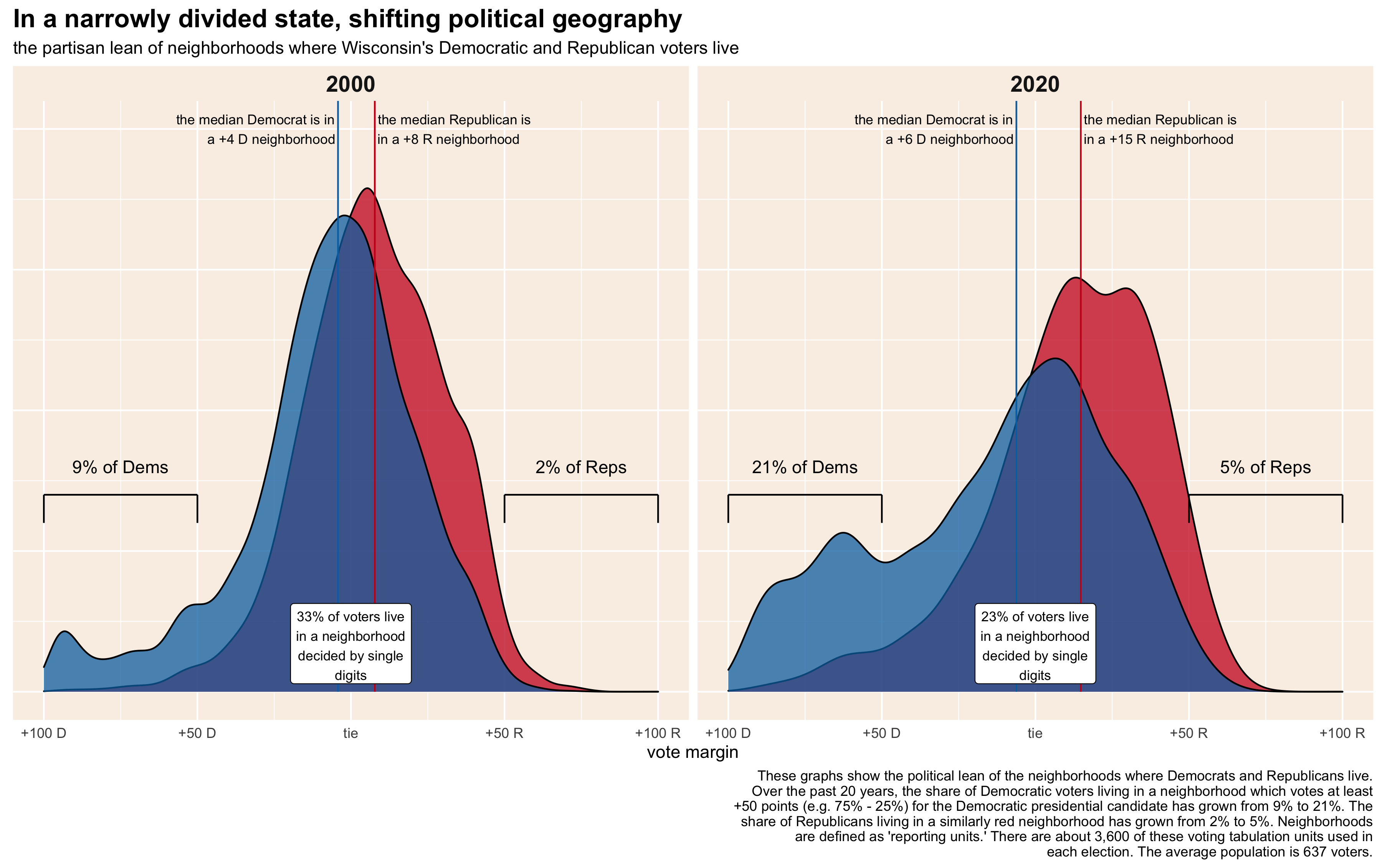
The number of voters living in a closely divided neighborhood shrank. In 2000, a third of voters lived in a place decided by single digits. That fell to 23% in 2020.
A greater share of Democrats now come from extremely blue neighborhoods. In 2020, 21% of Joe Biden’s voters came from places where he received at least a 50-point margin of victory. Only 9% of Al Gore’s voters came from such partisan places. The share of Republican voters living in similarly red places only increased by 3% over this period.
Still, Republicans also contributed to the rise in asymmetrical polarization. The partisan lean of the median Democratic voter’s neighborhood barely budged from 2000 to 2020. The median Gore voter lived in a place where Gore won the vote by 4 points, while the median Biden voter’s community gave Biden a 6-point victory. Compare that to the change in the average Republican’s neighborhood. The median Bush voter in 2000 lived in a neighborhood which Bush won by 8 points. The median 2020 Trump voter’s neighborhood gave him a 15-point victory.
Here’s another way of looking at it. In 2000, 42% of Democrats and 36% of Republicans lived in a neighborhood that the other party won. Twenty years later, 43% of Democrats lived in a place Trump won, but just 28% of Republicans lived in a Biden-voting neighborhood. Today, Democrats are more likely than Republicans to live in both places where they are the overwhelming majority and places where they form a noncompetitive minority.
Much is at stake in Wisconsin’s 2021 redistricting cycle. But whatever mapmaking scheme prevails, it will still fundamentally be a reflection of Wisconsin’s current political geography. Many more Democrats live in extremely Democratic places than Republicans in equivalently Republican places. At the same time, the average Republican’s neighborhood is much redder than the average Democrat’s is blue. In combination, these two facts give Republicans a basic structural advantage that persists even in mapping schemes that focus only on the traditional criteria of contiguity and compactness.
Any plausible Assembly map for the 2020s would probably still create a system where Republicans would win a majority of the seats even when Democrats win 51% of the vote statewide. But a non-gerrymandered map would increase, at least somewhat, the number of seats that either party could realistically win. A fairer map would also lower the size of the statewide victory Democrats require to win control of the Assembly. Under the current boundaries, I calculate that Democrats would need to win the state by about 8.2 percentage points to win a bare majority of 50 seats. Under the maps used in the 2000s, Democrats would need a 3.8-point victory.
An Assembly map drawn for the 2020s without partisan consideration would likely recreate the status quo of the 2000s. A strong Democratic victory like that of Barack Obama’s first campaign could likely flip control of the chamber. Anything less would still leave Republicans in control of a more narrowly divided legislature, consisting of more members with a realistic chance of losing their next election.
[i] I calculate this by averaging the vote margin in all contested 2012-18 elections for Governor, President, State Assembly, State Senate, US senate, or the House of Representatives using disaggregated ward data created by the Wisconsin Legislative Technology Services Bureau (LTSB).
[ii] Herschlag et al., page 2
[iii] Herschlag, Gregory; Robert Ravier; and Jonathan C. Mattingly, “Evaluating Partisan Gerrymandering in Wisconsin,” arXiv, September 7, 2017.
[iv] Chen, Jowei, “The Impact of Political Geography on Wisconsin Redistricting: An Analysis of Wisconsin’s Act 43 Assembly Districting Plan,” Election Law Journal, 16 (4), 2017.
[v] These maximally compact districts were designed by the software engineer Brian Olson using data from the 2010 Census. Details are on his website, https://bdistricting.com/2010/.
[vi] All these figures are from the Marquette Law School Poll using party identification, not including self-described independents who lean to a party.
Thank you for this detailed analysis! I appreciate how well you’ve set out a lot of the details showing why there is some amount of natural force accounting for the measured disparities – demographic self-packing of Democrats and federal mandates to gerrymander districts to favor certain minorities, for example. The rest of the analysis, explaining how the Republican action further tipped scales in their favor, is thorough and makes a lot of sense.
Question – for the analysis of “wasted” votes, doesn’t the presence of more uncontested races in Democrats’ favor confound that analysis? From how it’s described, it sounds like every vote in such a district after the first (or I guess after how many are necessary to exceed write-ins) are “wasted” (I really hate that term, by the way), and if there are more uncontested races where Democrats win than Republicans, that will create more “wasted” votes for Democrats.
Also, I question whether competitiveness of districts should be the goal, to the detriment of communities of interest. The more that like-minded people congregate together in neighborhoods (as your data show), the more those neighborhoods would have to be split up and people with very disparate interests artificially jammed together to try and make districts competitive.
Hi Tom. Thanks for the kind words. You raise some good questions.
I also think the term “wasted votes” is unhelpfully reductive, though the concept is useful. You’re entirely correct that it wouldn’t be meaningful to compare Democratic and Republican “wasted” vote totals in State Assembly races since Democrats typically contest dozens more races than Republicans. In the paper I cited, Jowei Chen calculated wasted votes using 2012 Presidential election votes in each Assembly race. Obviously, people do vote differently between Presidential and Assembly races, but I think top-of-the-ticket races are a reasonable approximation of partisan strength within districts.
Your last point is such an important question. I think most people have conflicting desires when it comes to redistricting. The text of Governor Evers’ executive order establishing the “People’s Maps Commission” calls for maps that are “free from partisan bias and partisan advantage” at the same time that it says districts should be “compact and contiguous” and “avoid splitting wards and municipalities.” It seems many people do not realize the extent to which those goals are in tension with each other.
A counterintuitive effect of geographical sorting is that more people today are represented by a legislator they voted for than in the past. My biggest problem with our current districts is that they result in so many unaccountable legislators. Very few Democrats or Republicans actually have a meaningful chance of losing their seat. That seems bad for democracy from any perspective. But explicitly designing districts to be as competitive as possible would be a radical departure from the basic justification for using political districts at all. My personal pipe dream solution is to turn each of the 33 State Senate districts into a 3-person multi-member district. Each voter casts one vote. The top 3 vote getters each receive a State Assembly seat.
The graphics for Illinois’s state legislative districts is also pretty suspect. At this point in political history, Republicans have been basically shut out of redistricting, and in some cases partisan gerrymandering, made it worse.
Another interesting data point is that Wisconsin somehow elected practically the most conservative and the most progressive U.S. Senators in back-to-back elections. Gerrymandering had nothing to do with those statewide elections.
Thanks for the thoughtful analysis.
One minor possible correction:
“Likewise, Donald Trump’s narrow statewide victory in 2016 defeated Biden in 63 of the actual districts, 58 of the old districts, and 61 of the maximally compact districts.”
I think you meant Clinton, and not Biden, here.
Thanks! Seems I need an editor.
Thank you for this incredibly detailed analysis. It’s very hard to find the election results of the last decade used on the 2002-2012 map. I just had two questions.
1. Why did you use the State Assembly districts and not the State Senate districts of the 2002-2012 maps? A big reason to choose for the State Senate maps would be that they have been the most competitive one of the two maps of the 2002-2012 cycle. Democrats have only controlled the State Assembly from 2009-2011, while having controlled the State Senate (in the 2002-2012 maps) from 2007-2011 and then again a few months in 2012/2013. Would the results of the past decades statewide elections be “fairer” if you had used the State Senate maps? Would Biden have won a majority of those in 2020? And Evers (18)?
2. How did you calculate the election results per State Assembly district? Did you use Excel? If so, could you please share your sheet with us so everyone can enjoy it and look in great detail at it? I, for one, would love to know just what the margins would have been in certain elections of the past decade.
Again, thanks for the effort for this article, it’s actually amazing when people research things like this!