Patterns of domestic migration—where people who already live in America choose to move—reveals a lot about where people do or don’t want to live. Or, framed differently, where they can and can’t afford to. This map shows the cumulative domestic migration of each US county, from 2020 to 2024.
The darkest green color shows places where the (net) number of people who’ve moved in since 2020 is equal to 10% or more of the population in 2020. The darkest purple color shows the reverse. In those counties the net number of people who’ve moved out is equal to 10% of the 2020 population. This only includes people who moved from one place in the United States to another, not people who moved into or out of the country.
Because this map shows net migration, a place where a roughly equal number of people move in and out—like a college town—won’t feature prominently.
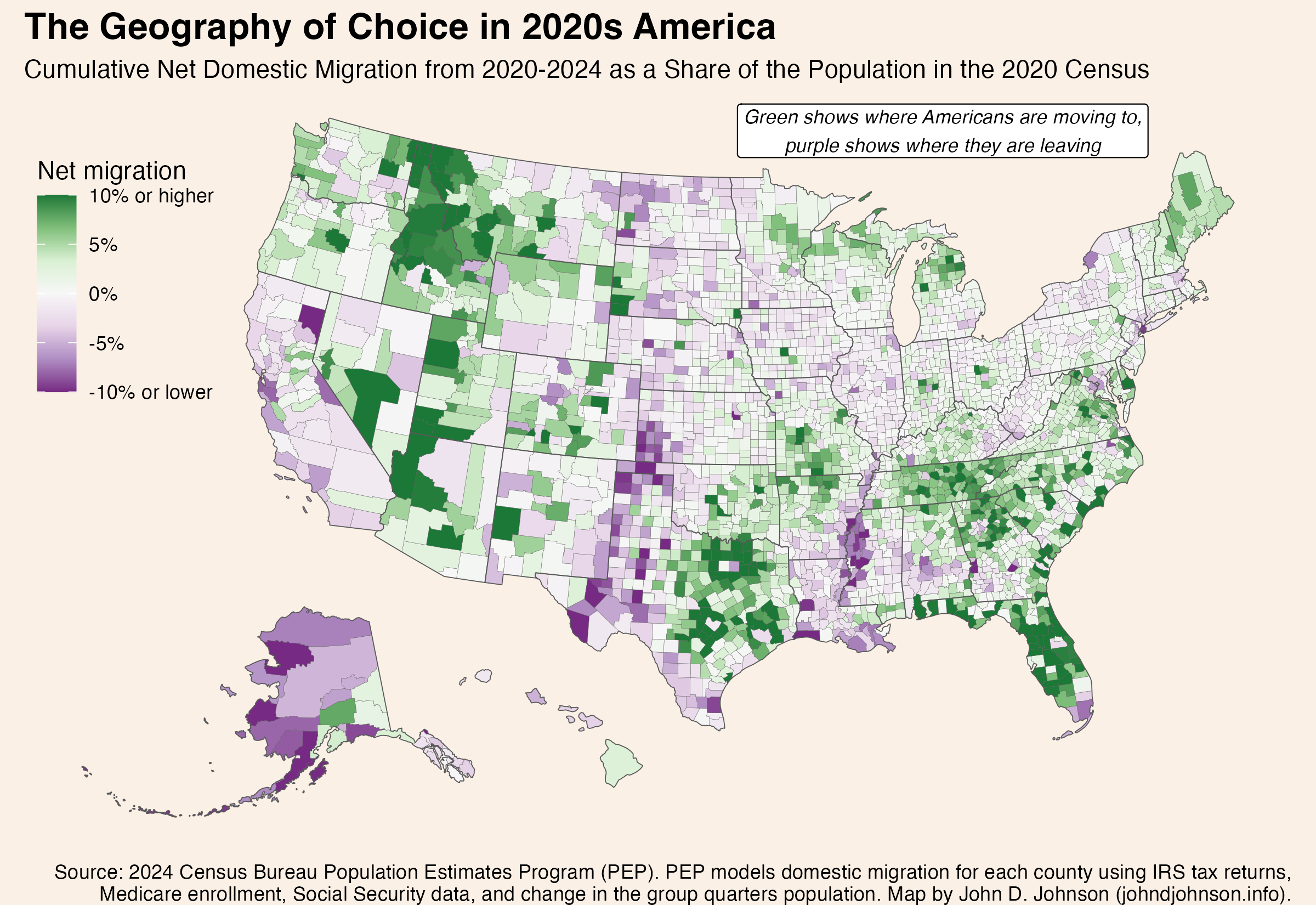
There are six times as many dark green counties as dark purple ones. A few counties are experiencing intense in-migration, while a lot of counties are seeing a small out-migration.
Some of the patterns seem to follow state boundaries, but more commonly they reflect urban agglomerations or ecological regions.
In fact, I was surprised by the extent to which certain ecological regions correspond to the patterns on this map. The next version of the map shows a few of the patterns that most stood out to me. I highlighted certain regions, like the Ozarks, by identifying the counties included in specific EPA Level III ecoregions. (Follow that link to see official maps of Level I, II, III, and IV ecoregions. They are fascinating).
I placed a county into one of these regions if its mean population weighted center in the 2020 census fell inside the region.
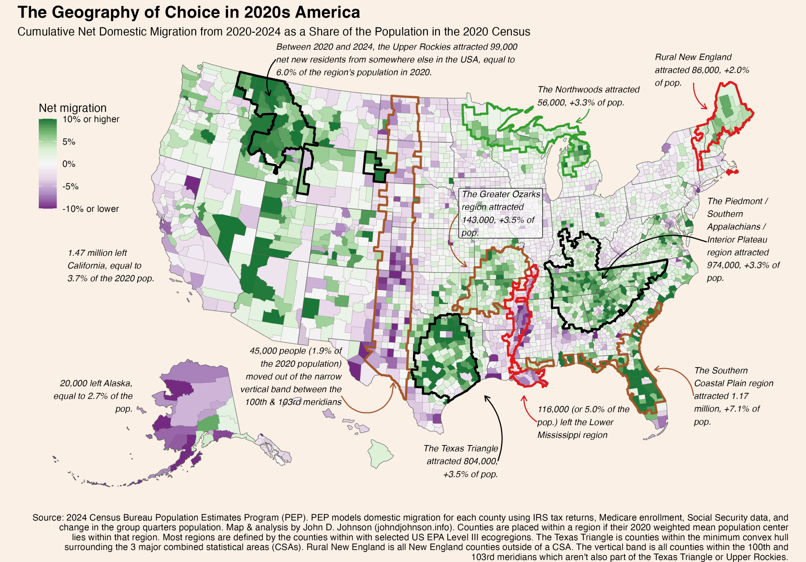
Rural Northern Tier Winners
Three pockets of growth dot the northern perimeter of the lower 48. Each is in a very different rural area.
The Upper Rockies
These are the 41 counties lying mostly inside of the following ecoregions: Northern Rockies, Canadian Rockies, Middle Rockies, and Idaho Batholith. Mostly, these are in Idaho and western Montana, but some stretch into northeastern Washington and a few disconnected pockets stretch all the way to extreme western South Dakota. Since 2020, these counties have gained about 99,000 net new residents who previously lived elsewhere in the country. That’s equal to 6.0% of the region’s total population in 2020.
The Northwoods
The “Laurentian Mixed Forest Province” (as it is also known) is a single ecoregion stretching from Minnesota’s iron range, through northern Wisconsin, across the entire Upper Peninsula, and into the northern half of Michigan’s lower peninsula. This whole area is scarcely populated: Duluth is the largest city. But since 2020, 56,000 more people have moved in than out of these 65 counties, equal to 3.3% of the population in the last census. This sets the Northwoods apart from pretty much everywhere else in the rural Midwest.
Rural New England
I’m using “rural” in an expansive sense. These are the 46 counties in New England’s six counties which lie outside of a combined statistical area. Since 2020, they’ve added 86,000 residents thanks to domestic migration, equal to 2.0% of their starting population. Notice that the New England counties located inside CSAs have fared less well. Nor have migrants flocked to nearby rural upstate New York.
Perhaps rural New England, the Northwoods of the Upper Midwest, and the northern Rockies are all benefiting from increased access to remote work in recent years. The absolute numbers of people moving to these regions are small, compared with some of the other regions we’ll discuss shortly. But because their populations were so low to begin with, the influx of new residents is enough to make a big different proportionally.
The Sunbelt is Still Hot
The biggest hotspots for domestic movers are in the American South. Many of these cross state lines in ways that follow ecoregions.
The Piedmont / Southern Appalachia
One such region covers portions of the Carolinas, Georgia, Alabama, Kentucky, and nearly all of Tennessee. The sprawling area (340 counties) basically corresponds to the ecoregion comprising Appalachia south of Virginia (the Blue Ridge Mountains, Southwestern Appalachians, Ridge and Valley) along with the plateaus to their east (the Piedmont) and west (the Interior Plateau). 974,000 more Americans moved into this region than out of it from 2020 to 2024, equal to 3.3% of the 2020 population.
Notice that I do make an artificial alteration to the ecoregion boundaries: cutting several off at the southern border of Virginia. Virginia displays its own pattern of migration growth, concentrated on the DC metro.
The Southern Coastal Plain
Florida’s appeal to domestic movers is legendary, and that’s most of what is happening in this region. But it turns out the counties attracting the most growth correspond even more closely to the boundaries of the Southern Coastal Plain ecoregion than they do to the state lines. Notice how the southern tip of Florida (a different ecoregion) had negative net migration, while Florida’s growth regions extend seamlessly along the Georgia and South Carolina coasts which are part of the same ecoregion. The 76 counties in the Southern Coastal Plain region added 1.17 million residents, equal to 7.1% of the 2020 population.
The Texas Triangle
The Texas Triangle isn’t any kind of official region, so you can define it different ways. I drew a concave hull around the combined statistical areas for Dallas, Houston, and San Antonio. Basically, it contains the biggest metros in Texas and everything in between them. All told, these 103 counties gained 804,000 net domestic movers, equal to 3.5% of the population.
The Greater Ozarks
This one surprised me the most. As a kid, I often visited my grandparents in Yellville, Arkansas, deep in the Ozark Mountains. The whole region seemed beautiful but sleepy. Evidently, that has changed. The Ozarks, and their surrounding ecoregions, grew considerably. This region of growth extends across several states. It includes the Ozark Highlands, Boston Mountains, Arkansas Valley, and Ouachita Mountains. From 2020 to 2024, these 92 counties gained 143,000 people from net domestic migration, worth 3.5% of the 2020 population.
Some Losers
Most of the places with more out-movers than in-movers only lost a very small fraction of their population. But a few regions stand out with more serious losses.
The Lower Mississippi
The Mississippi Alluvial Plain extends from the river’s confluence with the Ohio in southern Illinois all the way to its mouth in the Gulf of Mexico. Nearly all of these 58 counties lose more movers than they gain. In total, the region lost 116,000 people, or 5.0% of its population to net domestic migration from 2020 to 2024. Losses were even more severe (proportionally speaking) in the core of the region, the Mississippi Delta.
The 100th Meridian West
The 100th Meridian is notorious on the Great Plains as the location beyond which, it is often said, growing crops becomes impractical without irrigation. While making this map, I was struck by the vertical streak of population loss corresponding to the area immediately west of this line. The vertical region I’ve drawn is simply those counties lying mostly within the 100th and 103rd meridians (and outside of the Texas Triangle or Upper Rockies). This is basically the width of Oklahoma panhandle, extended north to Canada and south to Mexico. Collectively, the region’s 166 scarcely populated counties have only lost 45,000 people to domestic migration (1.9% of the population), but it includes counties with losses of 10% or more.
California
Finally, any discussion of net migration has to mention the county’s most populous state: California. From 2020 to 2024, 1.47 million more people moved from California to elsewhere in the United States than from a different state into California. That outflow is equal to 3.7% of the state’s 2020 population.