Joe Berrada, Billionaire
Tracing the Astonishing Rise of Milwaukee’s Largest Landlord
In commercial mortgage-backed securities issued by three banks throughout late 2024 and 2025, Youssef “Joe” Berrada—by far, Milwaukee’s largest landlord—is reported as having an “approximate” net worth of $1.027 billion and liquidity of $94 million.[i] This is an increase of $72 million from his reported net worth of $955 million shown in prospectuses filed with the Securities and Exchange Commission (SEC) earlier in 2024.[ii]
The loans were issued to LLCs controlled by Berrada Properties, but Youssef Berrada sponsored and guaranteed them in his own name. This is why the securities filings include his financial disclosures. In a normal mortgage (personal or commercial), the value of the property provides sufficient collateral for the loan. However, the filings explain that “the Mortgagor’s operations do not comply, with all of the separateness covenants required for it to be a Single-Purpose Entity.” The “mortgagor” in that sentence refers to the LLC taking on the loan. In plain English: the operations of Berrada’s various LLCs are connected in a way that might cause a judge to collapse them into a single entity in the event of a bankruptcy. In that sense, investing in this mortgage could expose the investor to risks from other parts of the Berrada business besides this one property. So Youssef Berrada personally commits “to be liable on a recourse basis” should this occur.
The loan documents provide Berrada’s net worth and liquidity as evidence or reassurance of his ability to make good on this commitment. Guarantor financial statistics are usually self-reported by the borrower and are not necessarily subject to Generally Accepted Accounting Principles (GAAP), meaning guarantors have considerable flexibility in how they calculate their own net worth. They might take a more optimistic view when valuing their assets than an auditor would. Still, it is unlawful to misrepresent one’s finances in a securities filing, and there is no reason to believe that Berrada has done so. Rather, what we can say is that, by Berrada’s own apparent estimation, he is a billionaire.
Which brings me to a question: Where is his money from? With only publicly available data, it’s impossible to say if it’s all from his rental business, other investments, or perhaps even family wealth. Nonetheless, Berrada’s property empire has grown prodigiously since he bought his first rental property 30 years ago, with most of the growth coming in just the past decade. My interest here is to try to sketch out the story.
From 8 Units to Ten Thousand
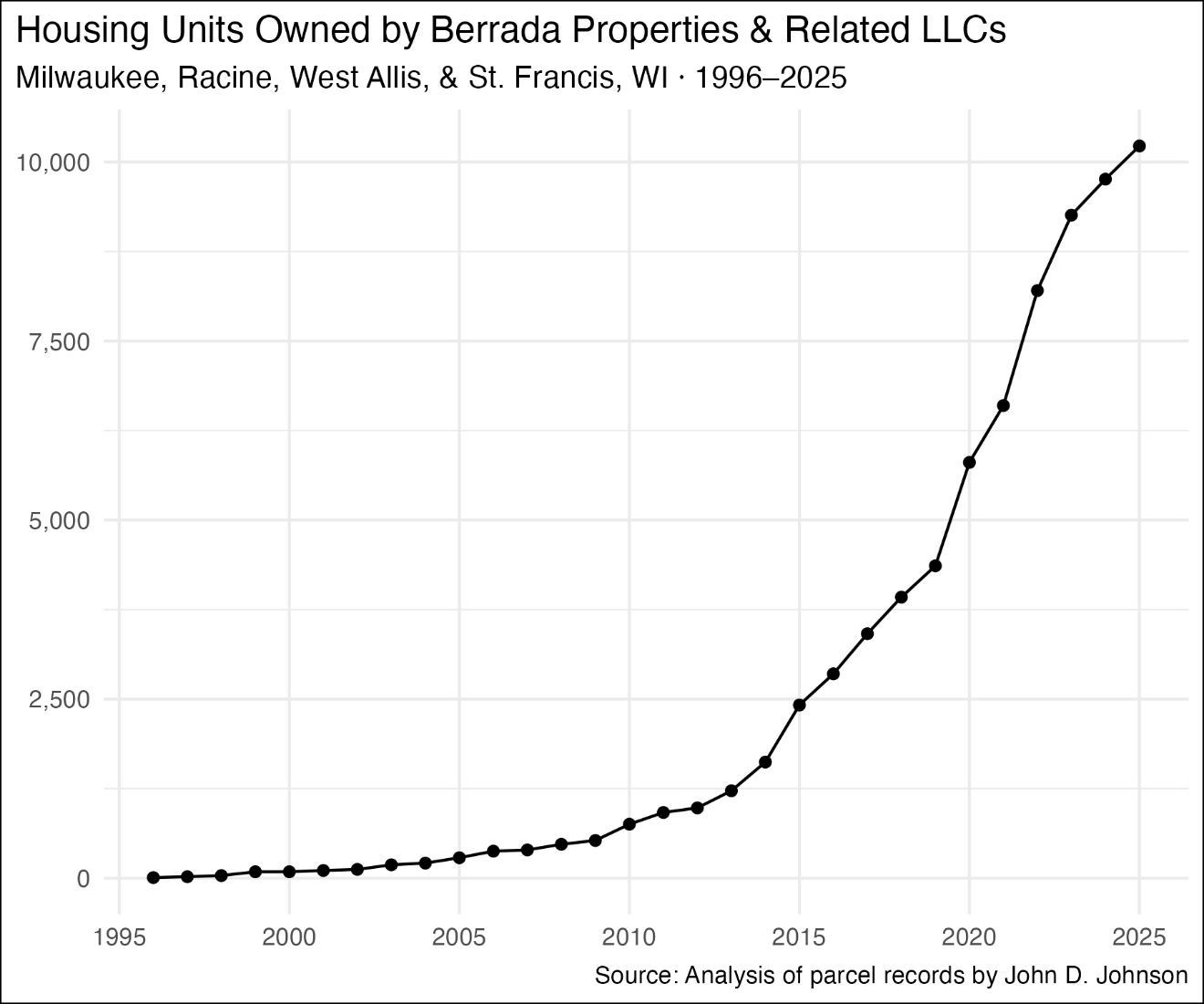
Berrada bought his first apartment building in Milwaukee in the spring of 1996 for $187,000. It’s an 8-unit building on Hampton and 79th. He owns it today (although he sold it in 2008 before buying it back in 2013). Since this initial purchase, the holdings of Berrada and LLCs affiliated with him have grown at an extraordinary clip. As of the end of 2025, I count over 880 apartment buildings holding a total of 10,223 housing units in the Berrada network.[iii]
Most of these properties are in the City of Milwaukee, where Berrada-affiliated companies own 9,720 units. I count 32 apartments across three properties in West Allis and 40 apartments in two St. Francis properties. Berrada also has a considerable presence in Racine, with 441 units in 33 parcels.
When I refer to the “Berrada network,” “Berrada-affiliated companies,” or the like, I mean both properties owned by Berrada in his personal capacity and those owned by LLCs connected to him. Unlike large corporate landlords such as VineBrook Homes or Greystar, Berrada Properties does not sell shares to investors, in either public or private markets. According to a filing from 2024, Berrada Properties was founded by Youssef Berrada and remains “family owned and operated.”[iv] See “Note on Defining the Berrada Network” at the end of this post for more details.
At times, Berrada’s growth has seemed almost exponential. He entered the 2000s with 89 units and ended the decade with 753 owned by him and affiliated companies. At the end of 2019, the Berrada network was roughly the same size as Milwaukee’s public housing authority (HACM), with about 4,200 units in Milwaukee and another 130 in Racine. Already the largest private landlord in the city, the Berrada network more than doubled in size from just 2019 to 2023. Parcel records show that the network acquired nearly 1,000 more units in 2024 and 2025.
Here is some context for just how unusual it is for a landlord to achieve a portfolio of this size, let alone an individual landlord, as opposed to a large corporation. According to this trade organization list, the largest landlord in the country in 2025 was Greystar, with 122,545 housing units owned. The 50th largest landlord on the list was JRK Property Holdings, which owned 25,796 units across operations in 23 states. Berrada’s portfolio of 10,223 units within Milwaukee and Racine counties, in other words, is 40% as large as the 50th largest corporate landlord in the entire country.
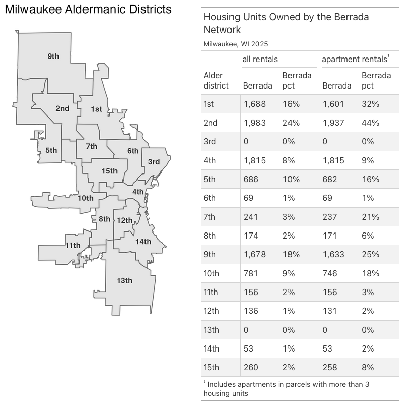
Where Berrada is concentrated
Citywide, Berrada-affiliated companies own 6.4% of all rental housing units. Milwaukee contains many rented single-family homes and duplexes, but Berrada specializes in apartment buildings. Among apartment buildings with at least 4 rental units, Berrada owns 10.9% of the housing stock.
The citywide figures obscure the true degree of the Berrada market dominance, because the holdings are concentrated in specific parts of the city, particularly on the far north and (increasingly) near west sides.
The northernmost fifth of the city is where Berrada’s heaviest concentration lies. In the 2nd Aldermanic District, Berrada companies own 24% of all rental units and 44% of rental units in an apartment building. In the neighboring 1st District, the companies own 16% of all units and 32% of apartment units. In the 9th District, Berrada-affiliated companies own 18% of all units and a quarter of apartments.
Berrada companies also own a double-digit share of apartments in the 5th district (16%), the 7th district (21%), and the 10th district (18%).
A particularly large number of Berrada properties are in the 4th District (1,815), but they are concentrated in the western portion of that district, rather than its also apartment-heavy downtown portion.
Only two districts, the 3rd and 13th, hold no Berrada properties.
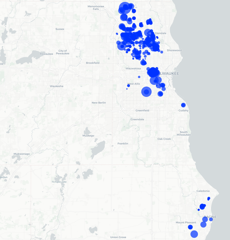
Berrada’s concentration of property ownership can feel even greater on a block-by-block level. Wells Street in the Concordia neighborhood between 27th and 35th streets is a striking example. That street is a mixture of grand old houses, some now B&Bs, interspersed between mid-size apartment buildings. Berrada made his first purchases here in 2015. Since then, he has acquired more buildings with alacrity. By the end of 2025, his companies owned 17 properties containing 459 apartments just along this 8-block stretch of Wells St.
These acquisitions were part of a broader buying spree across the near west side. Until 2015, Berrada owned no properties at all in this part of the city, which includes the 7 neighborhoods of Avenues West, Cold Spring Park, Concordia, Martin Drive, Merrill Park, Miller Valley, and Piggsville. Berrada-affiliated companies acquired 200 units in 2015 and owned 788 at the end of 2019. By the end of 2025, Berrada’s network owned 74 apartment buildings and 2,265 units on the near west side, equal to 28% of the area’s apartments.
The interactive map below shows the properties owned by Berrada-affiliated companies at the end of 2025. Click to open it in a new tab.
At this scale, the accumulation of wealth is enormous. The 2025 assessed value of all these properties together was around $625 million, but this substantially understates their market value.
I matched 26 individual mortgages obtained by Berrada companies with City of Milwaukee parcel records. Each mortgage covered between 67-168 apartments, and altogether the 24 mortgages refinanced 2,629 units (over a quarter of Berrada’s total). The data come from prospectuses filed in 2024 and 2025. The city assessed the value of these properties as $160.3 million in 2025. However, the appraisals for these properties shown to investors totaled $471.4 million. In other words, these properties were assessed by the city at just 34% of the value at which they were appraised by the market. Some of the appraisals came after the assessment window ended, but some did not. Applying this ratio of assessed-to-appraised value to the rest of Berrada’s properties would suggest a total value in excess of $1.7 billion.
That is the asset side of the business. On the revenue side, the same prospectuses also report the most recent annual effective gross income (EGI) for the properties in each mortgage. Across all 26 mortgages, the average monthly EGI per unit was $1,222. Applying this number to all of Berrada’s properties suggests a gross annual revenue of around $149 million.
What does it mean for Milwaukee (and, to a lesser extent, Racine) for so much property to be concentrated in a single landlord? In the northernmost fifth of Milwaukee, the odds are better than 1-in-4 that Berrada owns any given apartment one might look at.
The decisions Berrada Properties makes about how much rent to charge and how well to maintain its properties shapes the lives of perhaps 20,000 people or more (based on the average sizes of renting households).
Note on Defining the Berrada Network
The Berrada network includes many different LLCs, as well as properties whose owner is listed as Joe Berrada personally. Legally speaking, the LLCs are the owner of each property, while the beneficial owner of the LLC is unknown. But as a practical matter, a connection to Berrada is clear because these LLCs list one of Berrada’s addresses in their corporate registration paperwork or parcel tax records.
To be clear, Berrada isn’t trying to hide the connection. Regardless of the legal owner name, the apartment buildings often have prominent signs reading BERRADAPROPERTIES.com, and many of the LLCs have names like BERRADA PROPERTIES 74, LLC, and BERRADA PROPERTIES 117, LLC. Others have names referring to the apartment complex or a region of the city while using Berrada-linked addresses. For instance, MEAUX PARK, LLC owns 42 parcels on Long Island Drive, directly north of the titular park. Per state filings, the LLC’s principal office is Berrada’s complex at 10136 W FOND DU LAC AVE, and all of the individual properties receive their property tax bills at a Berrada-linked PO Box. A handful of LLCs present close questions, where the connection to Berrada is not entirely clear. In these instances, I have usually erred on the side of removing the properties from my understanding of the network. For these reasons, plus the occasional fallibility of tax rolls, my calculations are my best estimate of the size of Berrada’s network in any given year and may contain some small errors.
To create this analysis of Berrada’s rise, I used the Milwaukee Assessor’s archive of annual property database snapshots, which show the ownership of every property in the city at the end of each calendar year. For properties owned outside of Milwaukee, I used annual vintages of the statewide parcel file. For each year, I identified the addresses used by Berrada and the companies using those addresses. I then manually removed a handful of owners that appeared to be included erroneously, perhaps due to an incorrect parcel record. The final dataset includes more than 250 distinct names, which partly reflects the large number of LLCs Berrada uses and partly the idiosyncratic ways those LLC names are spelled when entered into the parcel database.
[i] Specifically, the documents report “an approximate net worth and liquidity of $1,026,844,321 and $94,434,037, respectively.” A recent example of this language is from WFCM 2025-C65. Youssef Berrada is listed as the guarantor of Loan 18 at A-1-25. Footnote 33 at D-2-33 contains the language about the guarantor’s net worth and liquidity. See also similar statements in BBCMS 2025-C35, BMO 2025-C12, BMO 2025-C11, WFCM 2025-C64, BBCMS 2024-C30, WFCM 2024-C63, and BBCMS 2024-C28.
[ii] See BMO 2024-C9, BBCMS 2024-C26, & BBCMS 2024-C24, which report “an approximate net worth and liquidity of $954,765,140.00 and $95,950,900.00, respectively.”
[iii] These statistics are based on parcel records maintained by municipal assessors. I collected Milwaukee statistics from the city’s Master Property File. For other municipalities, I used the 2025 statewide parcel file, which aggregated files from each county in the first half of 2025. Consequently, the statistics from other municipalities may be missing some transactions from later in the year.
[iv] BBCMS 2024-C24, A-3-109.