 Well, Typography for Lawyers, anyway. An interesting website with lots of information about typography (basic, intermediate, and advanced) and an appendix listing typography rules for various courts. That appendix links to a good essay on the Seventh Circuit Court of Appeals website, “Requirements and Suggestions for Typography in Briefs and Other Papers.”
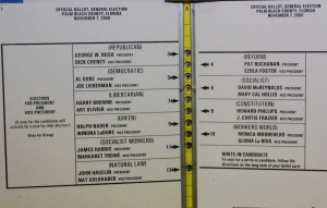
Why care about typography and document design? Well, as the site points out, citing the example of the infamous Palm Beach County butterfly ballot, the consequences of poor design and typography go beyond the “aesthetic.”
Hat tip to the Legal Writing Prof Blog (hat tipping Ruth Anne Robbins, author of a fantastic article on typography and document design, also available on the Seventh Circuit website).

That Seventh Circuit essay changed my life! Well, not really, but it did get me to question my unthinking acceptance of the default font choice in Microsoft Word, Times New Roman. The essay convinced me that TNR is a bad choice for standard 8.5 x 11 pages; the default on my computers is now set to Palatino Linotype, which is what I used for the last dozen or so briefs I filed in practice. It’s a wider font, so it uses more paper (and for some reason when “double-spaced” is way more than double-spaced; you may need to manually adjust the line spacing). But that’s the point — it’s easier to read because there are fewer characters per line. With many courts adopting word limits, not page limits, there’s no reason to adopt a narrow font. Except for those few misguided courts that require briefs to be in GIGANTO 14-point font, and double-spaced to boot.
I likewise had a “lightning bolt” moment when I first read that piece on the Seventh Circuit website. And more such moments when I read Ruth Anne Robbins’s article
But I had not yet considered the Palatino Linotype font, and it does look like a good one, so thanks for mentioning it.
Pretty good, but much of it seemed like an advertisement for non-standard font types.
And I will still double-space after my sentences as long as I live.
Well, Tom, I swear, I have no stock in other font types. And I double-space after my sentences, except, I guess, in that comment!