For months, journalists have documented the connection between conservative political beliefs and hesitancy (if not outright opposition) to receiving a COVID-19 vaccine.
Certainly, partisanship does play a strong role in Americans’ willingness to get vaccinated, but it doesn’t tell the whole story. Take Milwaukee and Ozaukee counties, for instance. Milwaukee is deep blue. Biden defeated Trump 69% to 29%. Ozaukee is one of the WOW counties–the historic stronghold of the Wisconsin Republican party. Trump defeated Biden there by 55% to 43%.
Knowing nothing else about southeastern Wisconsin, you might be forgiven for guessing that Milwaukee would enjoy a higher vaccination rate. In fact, 70% of adults in Ozaukee County are fully vaccinated, compared with 60% in Milwaukee. Across the United States, 88 counties have a higher adult vaccination rate than Ozaukee. Milwaukee ranks 307th.
This discrepancy probably doesn’t surprise anyone who lives in either of these counties. The partisan gap between Milwaukee and Ozaukee voters is more a symptom of their differences than a cause of them. Ozaukee is one of the richest counties in the country, Milwaukee one of the poorest. Ozaukee’s advantages extend beyond income.
“Social capital” is a term that captures many things. Chief among them is the idea of “collective efficacy”–a widespread belief that working together can effectively achieve shared goals. Popularized by Robert Putnam’s book Bowling Alone, social capital can be measured in different ways. But one recent effort to create “social capital index” for each U.S. county ranked Ozaukee 22nd and Milwaukee 1,885th.
I collected 5 statistics for each county in the United States, each of which I suspected might have some influence on COVID-19 vaccination rates. They are:
- 2020 presidential election results
- 2020 Census self-response rates
- each county’s social capital index score
- share of the population living below the poverty line
- COVID-19 deaths per capita
Here are the simple scatter plots comparing each of these values with vaccination rates. In each graph, I’ve colored red and labeled the dots for Milwaukee and Ozaukee counties.
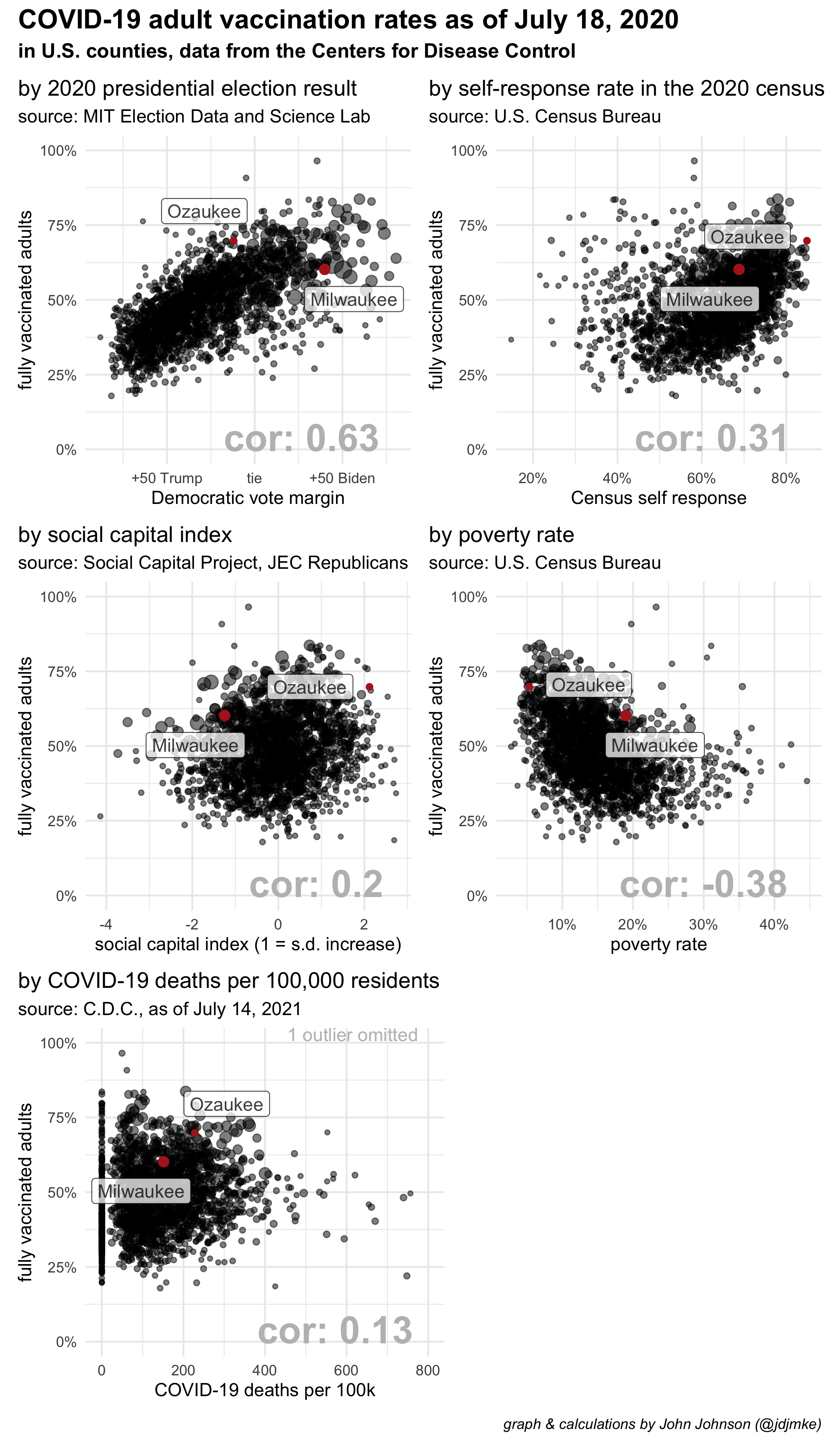
The correlation between 2020 vote choice and current vaccination rates is clear and strong, but many of these variables interact with each other in complex ways.
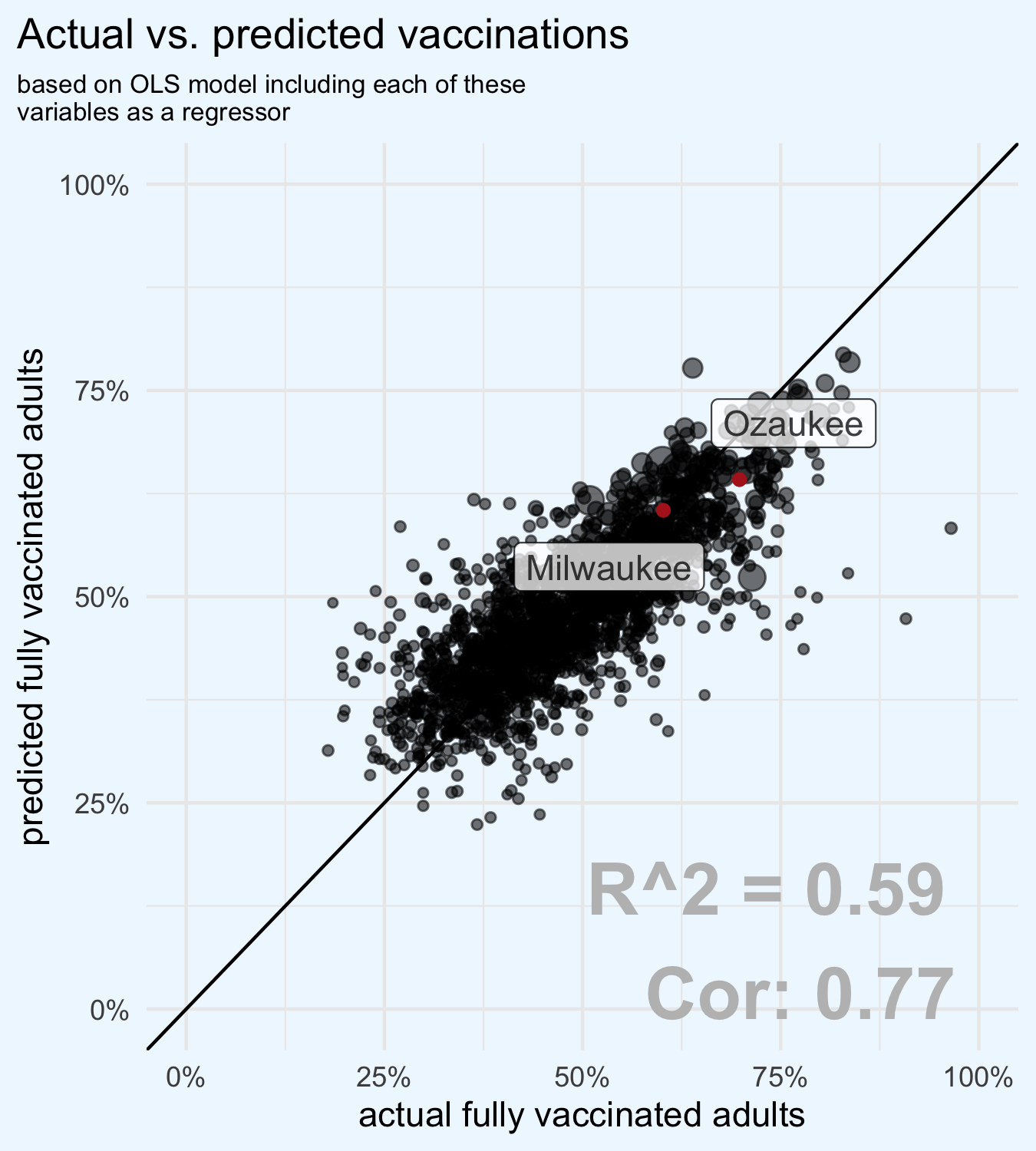
I ran a regression analysis testing each of these variables for an independent correlation with vaccination rates. First, I re-scaled each variable using z-score standardization. In other words, I subtracted the mean from each value, and divided by the standard deviation.
Here are the results of that regression. As expected, the outcome of the 2020 presidential election remains the largest and strongest predictor of vaccine behavior, but several other variables are also important predictors.
A 1-standard deviation increase in Biden’s margin of victory correlates with an 8 percentage point increase in the share of adults who are currently fully vaccinated.
A 1-standard deviation increase in the social capital index correlates with a 3 percentage point increase.
A 1-standard deviation increase in the COVID-19 deaths per capita correlates with a 0.9 percentage point increase in vaccinations.
A standard deviation increase in the poverty rate has essentially an equal and opposite effect on vaccinations as the same size increase in social capital.
When controlling for these other variables, census self-response rate is insignificant.
| Dependent variable: | |
| percent of adults who are fully vaccinated | |
| Biden vote margin | 8.167*** |
| (0.179) | |
| Census self-response | -0.281 |
| (0.197) | |
| social capital index | 3.132*** |
| (0.227) | |
| covid death rate | 0.901*** |
| (0.174) | |
| poverty rate | -3.040*** |
| (0.223) | |
| Constant | 47.550*** |
| (0.165) | |
| Observations | 2,068 |
| R2 | 0.590 |
| Adjusted R2 | 0.590 |
| Residual Std. Error | 7.475 (df = 2062) |
| F Statistic | 594.681*** (df = 5; 2062) |
| Note: | *p<0.1; **p<0.05; ***p<0.01 |
The model fits the data fairly well, and the correlation between actual vaccination rates and values predicted by the model is much higher than the correlation of any individual variable. Despite their differences, both Milwaukee and Ozaukee are well explained by the model.
Hi John. Thanks for posting this. It’s surprising to see such a good fit to a line. But I’m interested the outliers. For example, you have counties that (if they fit the line) would have been at 50% but instead some appear to be over 90% vaccinated and some others at 25% or less. I know these are in the minority, but was just wondering if you have and could comment on additional clues as to what pushed them to one extreme or the other off your line.
Thanks again.
Surprising that the poorest correlation is between vaccination rate and Covid death rate. I would have expected a fairly strong negative correlation coefficient there. Do you have a possible explanation?
I think it’s just because the vast majority of deaths happened before the vaccine actually got out?