This blog post continues the focus of the Law School’s Lubar Center on redistricting.
Many discussions of “gerrymandering” are hampered by an often  unacknowledged tension between competing goals. Gerrymandering is classically defined as weirdly-drawn districts manipulated from some ideal (or “natural”) form so as to benefit a particular party or politician. In practice, people see evidence of gerrymandering when one party consistently wins a share of legislative districts in excess of its proportion of the overall vote.
Proponents of “fair maps” may be motivated by concern over a partisan imbalance, but they typically define “fairness” with regard to the first definition of gerrymandering. A fair map is one drawn without regard to political advantage. Instead, districts should follow the boundaries of existing communities where possible.
There’s the rub. Imagine if Wisconsin’s Constitution called for our decennial redistricting to be carried out by an alien species of mapmaking specialists who are unaware of the existence of Democrats or Republicans but are nonetheless imbued with a passion for compactness, contiguity, and the preservation of municipal boundaries. These extraterrestrial cartographers could provide us with thousands of maps to choose from, but probably every last one of them would still give Republicans a legislative majority when the statewide vote was a tie. The reason, as we shall see, is where partisans live and how they cluster together.
Random districts
In the absence of alien drawn maps, I did the next best thing and used an algorithm developed by Harvard researchers in 2020 to create 50,000 maps of Wisconsin, each randomly dividing the state into 33 equally-sized districts. The algorithm requires districts to be contiguous and prioritizes compactness. Each district is within 1% of the ideal population division. In my implementation, the algorithm avoided crossing county lines but was completely ignorant of voting patterns. Unlike some other popular redistricting algorithms which work by introducing small variations to existing maps, this method generates maps that are essentially independent of each other. There are more technical details at the end of this post.
On its own, this ensemble of random maps is a good way to grasp precisely how Wisconsin’s political geography delivers a baked-in advantage to the Republican party in legislative races. The ensemble also provides a useful way to test claims of gerrymandering leveled against other districting schemes. By comparing other plans with the ensemble’s range of randomly generated outcomes, we can see what is an outlier and what is a natural consequence of where Wisconsin’s partisans live.
Asymmetrical geography
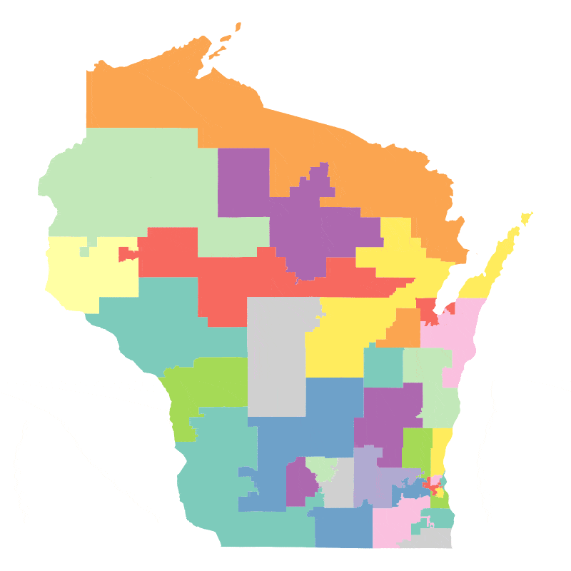
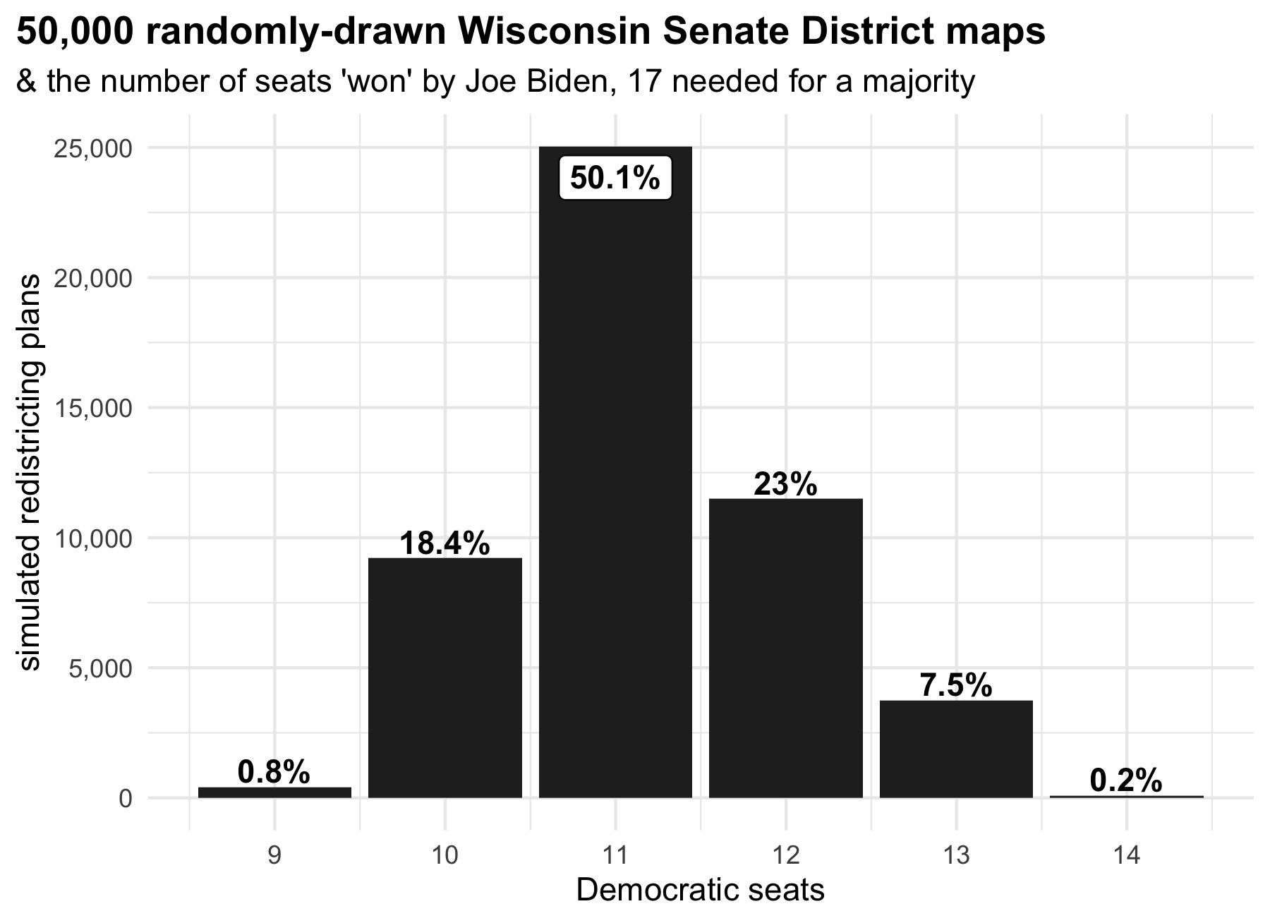
After generating each map, I calculated Joe Biden’s share of the vote in each district during the 2020 election. Recall that Biden won the state by 0.6%, good enough to defeat Trump in just 11 of the actual senate districts in 2020.
Biden also “won” 11 out of the 33 senate districts in fully half of the simulated maps. He carried more than that in a third of the maps and fewer in a fifth. But the range of outcomes, even across 50,000 random maps, remains limited. None of the simulated plans came close to turning Biden’s narrow statewide victory into a majority of the Senate.
This plot below shows why all the redistricting schemes failed to turn statewide Democratic votes into a proportionate number of senate seats. It shows the 2020 presidential election result in all the randomly drawn districts. The distribution is anything but symmetrical. Out of 1,650,000 districts, just 28 featured a Republican victory margin of more than 40 points. By contrast, 253,166 seats saw such a large Democratic margin.
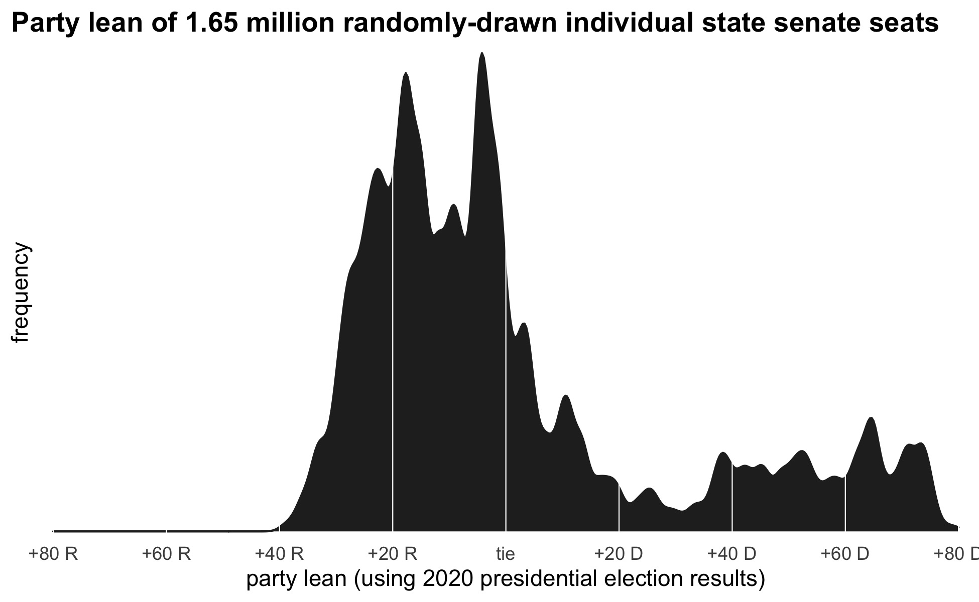
This is just a basic outcome of more people living in deep blue neighborhoods than deep red ones. In 2020, a fifth of Wisconsin Democrats lived in a neighborhood that gave Joe Biden a 50-point victory or more. Only 1-in-20 Republicans lived in a similarly Trump-leaning place.
The clustering of Democrats in cities gives them more extremely Democratic seats than there are extremely Republican seats, but this also reduces the total number of districts with a close partisan balance. The effect of partisan concentration is an advantage in winning a Senate majority for the other party, the Republicans in this case.
Gerrymandering reduces competitiveness
Our analysis thus far suggests that in a narrow election like the one in 2020, the results of the 2011 Republican-drawn state Senate map are little different than the results from any other map drawn in accordance with Wisconsin’s principles of contiguity, compactness, and respect for municipal boundaries.
But that does not mean that the Republican redistricting efforts were ineffectual. Wisconsin’s basic political geography means that Republicans can comfortably keep a Senate majority even when losing statewide by a few points. The effect of the gerrymander was to extend that advantage, insulating their majority against even larger statewide swings.
Taking the distribution of Democrats and Republicans in 2020 as a starting point, the chart below compares the statewide vote margin needed for Democrats to win a majority of the Senate under the actual seats drawn in 2011 and under the seats in the ensemble of maps. The dark black line shows the median of the ensemble of 50,000 randomly drawn districts; the dashed lines show the 75th and 25th percentiles; and the dotted lines show the minimum and maximum seats won.
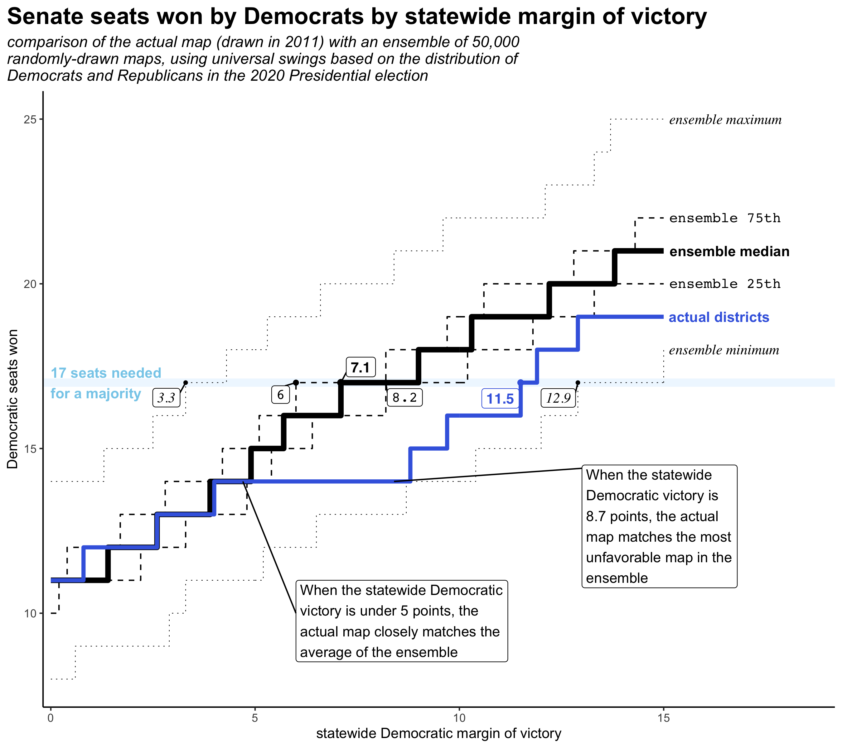
Out of all 50,000 randomly-generated maps, the median map would require a 7.1-point Democratic margin of victory statewide, in order for Democrats to carry 17 seats in the Senate. Measured this way, half the maps lie between a margin of 6 points and 8.2. The most favorable to Democrats requires only a 3.3-point statewide victory. The worst map requires a victory of 12.9 points.
Under the existing Senate map, Democrats would require a statewide victory of 11.5 points in order to win 17 seats. This makes it worse for Democrats than all but 77 of the 50,000 random maps.
The normal standards for drawing districts emphasize contiguity, compactness, and preserving municipal boundaries as well as other less-definable communities of interest. In a state like Wisconsin, this means that Republicans have a locked-in advantage over Democrats from the start because Democrats are much more geographically clustered than are Republicans, all the way down to the neighborhood level. As our large ensemble of random mapping schemes shows, essentially any map will give Republicans a majority in the state legislature when the state is tied 50-50–provided the geographic distribution of Democrats and Republicans remains unchanged, and provided we want to respect existing municipal boundaries as much as possible and favor compact district shapes.
The ensemble also shows a key difference relative to the 2011 map. Unlike in the map passed by Republicans, most of the ensemble maps show a steady relationship between statewide vote share and seats won. In other words, these maps include more competitive districts. Using 2020 presidential election results, only 3 districts were settled by 5 points or fewer in the actual maps. In the median random map, 6 districts were this close.
Given Wisconsin’s political geography and rules for redistricting, a “fair” map–by which I mean a map drawn without regard to political parties–would still benefit Republicans. However, it would differ from the current map in that elections would be more consequential. More seats will be at stake for each party in every election.
Technical note
The ensemble of random maps was created using the {{redist}} package for R, which is part of the Algorithm-Assisted Redistricting Methodology (ALARM) Project at Harvard University. Specifically, we used the a Sequential Monte Carlo algorithm developed by Cory McCartan and Kosuke Imai and described in this paper.
The source geography for our maps was the Census Bureau’s Voting Tabulation Districts (VTDs), used in the 2020 census. Election data is from disaggregated ward returns provided by the Wisconsin Legislative Technology Services Bureau (LTSB). The LTSB’s ward records match census VTDs nearly perfectly. In those few cases without a match, wards were assigned to the VTD with which they primarily overlap.
Your analysis has confirmed my hypothesis that fair districts are not necessarily competitive districts. I have begun to wonder about the rationale for districts if their existence leads to “undemocratic” outcomes. Would the effort headed by former AG Holder lead to fair or to competitive districts, since competitive districts demand a palpable thumb on the scale?
Thank you for your clear answer to my original question and for the flock of questions your answer arouses.