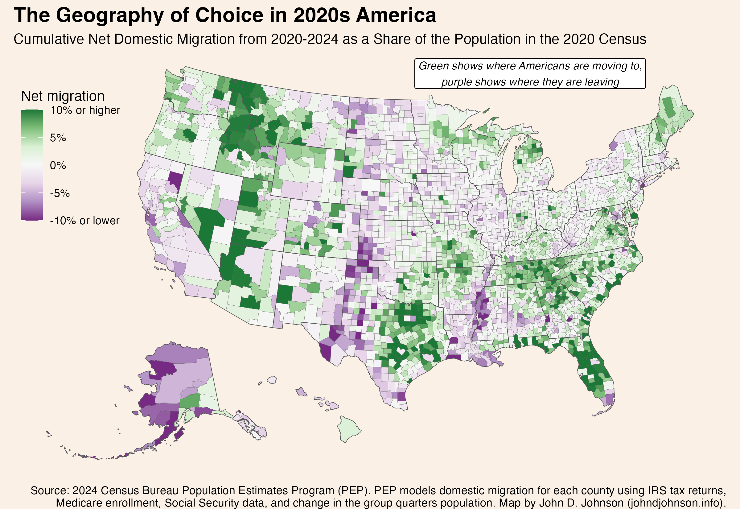
Where Americans Choose to Move and Where They Leave: Domestic Migration from 2020 to 2024

Patterns of domestic migration—where people who already live in America choose to move—reveals a lot about where people do or don’t want to live. Or, framed differently, where they can and can’t afford to. This map shows the cumulative domestic migration of each US county, from 2020 to 2024.

The darkest green color shows places where the (net) number of people who’ve moved in since 2020 is equal to 10% or more of the population in 2020. The darkest purple color shows the reverse. In those counties the net number of people who’ve moved out is equal to 10% of the 2020 population. This only includes people who moved from one place in the United States to another, not people who moved into or out of the country.

Because this map shows net migration, a place where a roughly equal number of people move in and out—like a college town—won’t feature prominently.

map showing US counties shaded corresponding to their net domestic migration from 2020 to 2024

There are six times as many dark green counties as dark purple ones. A few counties are experiencing intense in-migration, while a lot of counties are seeing a small out-migration.

Some of the patterns seem to follow state boundaries, but more commonly they reflect urban agglomerations or ecological regions.

In fact, I was surprised by the extent to which certain ecological regions correspond to the patterns on this map. The next version of the map shows a few of the patterns that most stood out to me. I highlighted certain regions, like the Ozarks, by identifying the counties included in specific EPA Level III ecoregions. (Follow that link to see official maps of Level I, II, III, and IV ecoregions. They are fascinating).

I placed a county into one of these regions if its mean population weighted center in the 2020 census fell inside the region.

map, with regions outlined and annotated, showing US counties shaded corresponding to their net domestic migration from 2020 to 2024

Rural Northern Tier Winners

Three pockets of growth dot the northern perimeter of the lower 48. Each is in a very different rural area.

The Upper Rockies

These are the 41 counties lying mostly inside of the following ecoregions: Northern Rockies, Canadian Rockies, Middle Rockies, and Idaho Batholith. Mostly, these are in Idaho and western Montana, but some stretch into northeastern Washington and a few disconnected pockets stretch all the way to extreme western South Dakota. Since 2020, these counties have gained about 99,000 net new residents who previously lived elsewhere in the country. That’s equal to 6.0% of the region’s total population in 2020.

The Northwoods

The “Laurentian Mixed Forest Province” (as it is also known) is a single ecoregion stretching from Minnesota’s iron range, through northern Wisconsin, across the entire Upper Peninsula, and into the northern half of Michigan’s lower peninsula. This whole area is scarcely populated: Duluth is the largest city. But since 2020, 56,000 more people have moved in than out of these 65 counties, equal to 3.3% of the population in the last census. This sets the Northwoods apart from pretty much everywhere else in the rural Midwest.

Rural New England

I’m using “rural” in an expansive sense. These are the 46 counties in New England’s six counties which lie outside of a combined statistical area. Since 2020, they’ve added 86,000 residents thanks to domestic migration, equal to 2.0% of their starting population. Notice that the New England counties located inside CSAs have fared less well. Nor have migrants flocked to nearby rural upstate New York.

Perhaps rural New England, the Northwoods of the Upper Midwest, and the northern Rockies are all benefiting from increased access to remote work in recent years. The absolute numbers of people moving to these regions are small, compared with some of the other regions we’ll discuss shortly. But because their populations were so low to begin with, the influx of new residents is enough to make a big different proportionally.

The Sunbelt is Still Hot

The biggest hotspots for domestic movers are in the American South. Many of these cross state lines in ways that follow ecoregions.

The Piedmont / Southern Appalachia

One such region covers portions of the Carolinas, Georgia, Alabama, Kentucky, and nearly all of Tennessee. The sprawling area (340 counties) basically corresponds to the ecoregion comprising Appalachia south of Virginia (the Blue Ridge Mountains, Southwestern Appalachians, Ridge and Valley) along with the plateaus to their east (the Piedmont) and west (the Interior Plateau). 974,000 more Americans moved into this region than out of it from 2020 to 2024, equal to 3.3% of the 2020 population.

Notice that I do make an artificial alteration to the ecoregion boundaries: cutting several off at the southern border of Virginia. Virginia displays its own pattern of migration growth, concentrated on the DC metro.

The Southern Coastal Plain

Florida’s appeal to domestic movers is legendary, and that’s most of what is happening in this region. But it turns out the counties attracting the most growth correspond even more closely to the boundaries of the Southern Coastal Plain ecoregion than they do to the state lines. Notice how the southern tip of Florida (a different ecoregion) had negative net migration, while Florida’s growth regions extend seamlessly along the Georgia and South Carolina coasts which are part of the same ecoregion. The 76 counties in the Southern Coastal Plain region added 1.17 million residents, equal to 7.1% of the 2020 population.

The Texas Triangle

The Texas Triangle isn’t any kind of official region, so you can define it different ways. I drew a concave hull around the combined statistical areas for Dallas, Houston, and San Antonio. Basically, it contains the biggest metros in Texas and everything in between them. All told, these 103 counties gained 804,000 net domestic movers, equal to 3.5% of the population.

The Greater Ozarks

This one surprised me the most. As a kid, I often visited my grandparents in Yellville, Arkansas, deep in the Ozark Mountains. The whole region seemed beautiful but sleepy. Evidently, that has changed. The Ozarks, and their surrounding ecoregions, grew considerably. This region of growth extends across several states. It includes the Ozark Highlands, Boston Mountains, Arkansas Valley, and Ouachita Mountains. From 2020 to 2024, these 92 counties gained 143,000 people from net domestic migration, worth 3.5% of the 2020 population.

Some Losers

Most of the places with more out-movers than in-movers only lost a very small fraction of their population. But a few regions stand out with more serious losses.

The Lower Mississippi

The Mississippi Alluvial Plain extends from the river’s confluence with the Ohio in southern Illinois all the way to its mouth in the Gulf of Mexico. Nearly all of these 58 counties lose more movers than they gain. In total, the region lost 116,000 people, or 5.0% of its population to net domestic migration from 2020 to 2024. Losses were even more severe (proportionally speaking) in the core of the region, the Mississippi Delta.

The 100th Meridian West

The 100th Meridian is notorious on the Great Plains as the location beyond which, it is often said, growing crops becomes impractical without irrigation. While making this map, I was struck by the vertical streak of population loss corresponding to the area immediately west of this line. The vertical region I’ve drawn is simply those counties lying mostly within the 100th and 103rd meridians (and outside of the Texas Triangle or Upper Rockies). This is basically the width of Oklahoma panhandle, extended north  to Canada and south to Mexico. Collectively, the region’s 166 scarcely populated counties have only lost 45,000 people to domestic migration (1.9% of the population), but it includes counties with losses of 10% or more.

California

Finally, any discussion of net migration has to mention the county’s most populous state: California. From 2020 to 2024, 1.47 million more people moved from California to elsewhere in the United States than from a different state into California. That outflow is equal to 3.7% of the state’s 2020 population.

Continue ReadingWhere Americans Choose to Move and Where They Leave: Domestic Migration from 2020 to 2024

Milwaukee’s Baby Bust Hit New Lows in 2025

The fewest babies on record were born to Milwaukee mothers in 2025, according to preliminary vital statistics records.

As of January 5th, the state’s vital statistics database shows 7,343 Milwaukee births in 2025. Based on the reporting pattern in previous years, I estimate that the total number of 2025 births will stand at about 7,386 after the last records trickle in.[i]

This is a 5.0% decline from 2024, when 7,774 babies were born to Milwaukee moms. It is a 15.0% decline since 2020 and a 28.7% decline since 2010.

line graph showing the number of babies born to Milwaukee mothers, 1990 to 2025

Births are only one component of population puzzle. Each year, people of all ages move both in and out of Milwaukee. But the number of births is the first ingredient of our future population, and the number of babies born has ripple effects in every following year. For example, in a response (at least partly) to declining demand, one large Milwaukee hospital stopped delivering babies altogether in 2022.

The drop in births throughout the 2010s also explains why Milwaukee’s population loss in the 2020 census was so surprising. The 2020 census came in well below what projections based on administrative data predicted. Those projections used birth and death records collected at the county level, and they estimated the county’s overall population accurately. The problem was that the Census Bureau model allocated births to each municipality based on patterns from the 2010 census, when, in fact, the share of babies born in the suburbs grew, relative to the city: a fact independently confirmed by both the 2020 census and local vital statistics.[ii]

Birth counts quickly affect school enrollments. Milwaukee’s births actually remained steady—even growing a bit—between the late 1990s and the late 2000s. This had a stabilizing effect on school enrollments, benefiting each sector of the city’s fragmented school system. There were actually more first graders attending a Milwaukee school in the 2014-15 school year than in 2005-06.

Then enrollment began to fall. The Great Recession, accompanied by an extreme mortgage foreclosure crisis in Milwaukee, coincided with a sharp drop in births. Newborn counts fell from 11,457 in 2007 to 9,213 in 2018. By 2023-24, there were 1,500 fewer first graders attending a Milwaukee school than in 2014-15.

During the COVID-19 pandemic, births dropped by 14.5% from 2019 to 2022. This was nearly three times the statewide decline of 5.1% over this period, so the drop in Milwaukee likely reflects prospective parents leaving the city in addition to couples putting off having a kid. Supporting this, census data shows a net outflow of 15,800 people leaving Milwaukee in the year ending July 1, 2021. Things improved after that, and net migration actually turned slightly positive in the year ending July 1, 2024, when the city gained about 500 residents in this way.

Mirroring this net migration pattern, births fell most sharply in the calendar years 2020 and 2021, before remaining more stable in 2023 and 2024. The renewed sharp drop in 2025 may indicate a resumption of negative net migration for the city or changes to the age profile and childbearing preferences of existing residents. Some hints might be gleaned from the map of where births have fallen in Milwaukee.

These three maps show, from left to right, the total number of babies born in each City of Milwaukee zip code during 2025, the change from 2024 to 2025, and the change from 2019 to 2025.

maps showing the number of babies born in each zip code and comparing this with 2024 and 2019.

The cumulative effect of Milwaukee’s years-long run of declining births is large. As we begin 2026, 39,210 babies were born in Milwaukee over the past 5 years. At the beginning of 2020, that number was 46,345. Here are some final thoughts:

  • There is no sign that Milwaukee’s baby bust has bottomed out. Two years ago, I thought it might have, but the latest data points toward continued declines of several hundred babies each year.
  • Schools across all sectors will face declining enrollment for the foreseeable future, with each cohort likely being smaller than the last.
  • While it is true that fertility rates are declining nearly everywhere, I think the rapidity (and location) of Milwaukee’s baby bust points to out-migration of prospective parents as a large factor. Much of this could be solved if more young couples felt Milwaukee was a good place to raise a family. In general, in Milwaukee’s healthiest and safest neighborhoods, the baby bust is either small or not happening at all.

[i] In the last couple years, a little over half of one percent of birth records were still outstanding by the following January 5th.

[ii] The Census Bureau Population Estimates Program uses vital statistics and modeled migration data to estimate county-level population. It then allocated the county-level population into municipalities based on the number of housing units in each (another tracked metric) and the average household size in the previous decennial census. In Milwaukee, the city’s average household size actually fell from 2.5 in 2010 to 2.39 in 2020, while in the Milwaukee County suburbs, the average household size stayed about the same.

Continue ReadingMilwaukee’s Baby Bust Hit New Lows in 2025

Attention to news in 2025

What we noticed and what we ignored

Time for a look back at the news of 2025 and what the public paid attention to and what it largely ignored. The year has not lacked for news, especially political news as Donald Trump expanded his authority through executive orders, followed by litigation over those orders.

My Marquette Law School Poll asks how much people have heard or read about recent events in the news in each poll:

Here are some recent topics in the news. How much have you heard or read about each of these?

Polls are conducted every other month, six times a year. This is not a comprehensive review of news events but provides a look at how much attention the public gave to a wide variety of mostly political news. Topics are picked from recent events that have received significant coverage and raise important political issues, with more emphasis on news stories published within a few weeks of each poll’s field dates.

Figure 1 shows the 32 topics asked about over the year.

The top topic of the year, by a substantial margin, is tariffs. The May survey came a month after Trump’s “Liberation Day” announcement of tariffs on April 2 and the subsequent changes made in rates and implementation dates. Fully 81% of U.S. adults said they had heard or read a lot about the tariffs.

The second most attention went to Trump’s plans for deportation of immigrants in the U.S. illegally, with 70% hearing a lot about this in the first month of the administration. Subsequent items concerning immigration issues varied in visibility, with the mistaken deportation of a man, Kilmar Abrego Garcia, who was sent to El Salvador in March ranking as the 7th most followed event, with 63% hearing a lot. When Garcia was returned to the U.S. in June, only 37% heard a lot about that, ranking 25th of 32 news items.

Cuts to the federal workforce ranked 3rd most followed story, with 67% hearing a lot as of May. Rounding out the top five news items were the war between Israel and Iran in June and the contentious meeting between Trump and Ukraine President Volodymyr Zelenskyy on February 28th in the Oval Office. U.S. airstrikes on nuclear facilities in Iran ranked 6th.

At the bottom of the chart are Trump’s attempts to remove a member of the Federal Reserve Board and the firing of the director of the Centers for Disease Control, followed closely by 30% and 29% respectively.

If you follow politics enough to be reading this post you will probably to shocked that attention to the November elections for governor in New Jersey and Virginia ranks 31st of 32 events, with only 28% hearing a lot about this. For us political junkies, it is a reminder that much of the public doesn’t follow politics closely, and especially not elections in states other than their own.

The honor of being the least followed of the 32 stories is Trump’s extended diplomatic trip to Asia in late October, during the shutdown of the federal government, with only 24% who paid a lot of attention to that trip.

Attention to news by party

Figure 2 shows attention to these news topics by party. A higher percentage of Democrats than Republicans say they have read or heard a lot about most of the news events covered during 2025. By comparison to either party, independents are considerably less likely to have followed news across every item.

Highly visible events receive more attention across all partisan lines while more obscure events are also followed less by each party group. The correlation of attention for Democrats and Republicans is .78. Independent attention correlates with Democratic attention at .91, and with Republican attention at .85. In short, news tends to penetrate each partisan group in similar ways though with generally lower attention from Republicans and especially independents.

Republican vs Democratic attention to news

Figure 3 shows the attention gap between Republicans and Democrats across the 32 topics, arranged by size of the difference between Republican and Democratic attention. For the news items we asked about, Democrats say they have heard or read more than do Republicans for 24 items, Republicans more for 5 items and the parties are tied for 3 items.

It is notable that the items with greater attention from Republicans are closely tied to Trump. Attention to his inaugural address shows the largest Republican advantage over Democrats in attention, 27-percentage points, followed by Trump’s speech to a joint session of Congress (don’t call it a State of the Union address) with an 11-point GOP lead in attention. Other topics with a Republican advantage closely concern Trump–the cease-fire agreement between Israel and Hamas and the U.S. airstrikes on Iranian nuclear facilities.

At the opposite end of the partisan attention gap, Democrats paid much more attention to the “No Kings” protests in October, by 23-points, and to a measles outbreak in Texas and New Mexico in the winter by 20-points. Democrats also paid substantially more attention than Republicans to the firing of the CDC director and reductions in the federal workforce.

Perhaps surprisingly, Democrats paid considerably more attention in September to the potential release of the Jeffrey Epstein files than did Republicans, by 16-points. (This does not cover the actual release of the files in December, after our final poll of 2025 in November.) Coverage of this issue has emphasized pressure from Republicans and MAGA activists for the release, though Democrats also supported the law to require the files to be made public.

This invites the question of whether Democrats simply pay more attention to politics than do Republicans.

In fact, attention to politics is virtually identical for Republicans and Democrats, while independents are much less attentive in general. We ask

Some people seem to follow what’s going on in politics most of the time, whether there’s an election going on or not. Others aren’t that interested. How often do you follow what’s going on in politics…?

Forty-nine percent of Democrats say they follow politics most of the time, as do 48% of Republicans, a trivial difference. In contrast, only 26% of independents say they follow politics most of the time. The lower attention from independents is reflected in their notably lower levels of attention to news events, but this can’t account for Republican and Democratic differences across news items. Table 1 shows attention to politics by partisanship in 2025 surveys.

One plausible explanation is that partisans follow different news sources, and those sources give different emphasis to specific news events. I don’t have data on the actual content of various news sources, but in my data there are only small (typically 3-4 point differences) in awareness of news events between Republicans who follow only conservative news sources and those who follow a mix of conservative and liberal sources, and a similarly small difference for Democrats who follow only liberal sources versus a mix of liberal and conservative sources. This casts some doubt on the idea that it is differences in content that drives differential awareness, and suggests that partisanship has more to do with what news people pay attention to, and remember. More on this in a future post.

The data tables

For those who want to see the numbers in detail here you go. Table 2 shows those who heard or read a lot, a little and nothing at all for each news event. While there is some variation, the most prominent news items have high “heard a lot” and low “nothing at all”, and the less prominent items reverse this.

Table 3 shows high attention to news by party identification.

Continue ReadingAttention to news in 2025