Milwaukee home sales volume follows to lowest in years, prices are trailing inflation
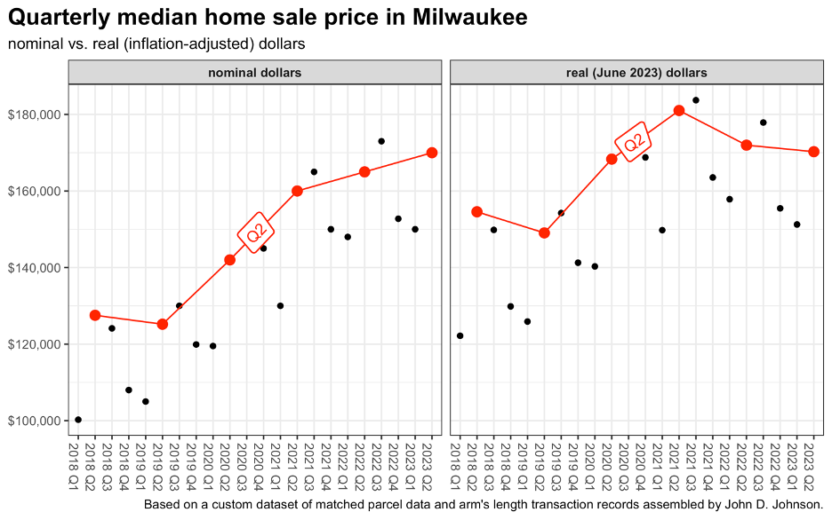
The number of houses sold in Milwaukee fell by 32% during the second quarter of 2023, compared to the same period last year. While prices continued to rise, they did so more slowly than the inflation rate.
In “real,” inflation-adjusted dollars, the median sale price was about $10,000 below the peak in 2021, albeit still well above pre-pandemic prices.
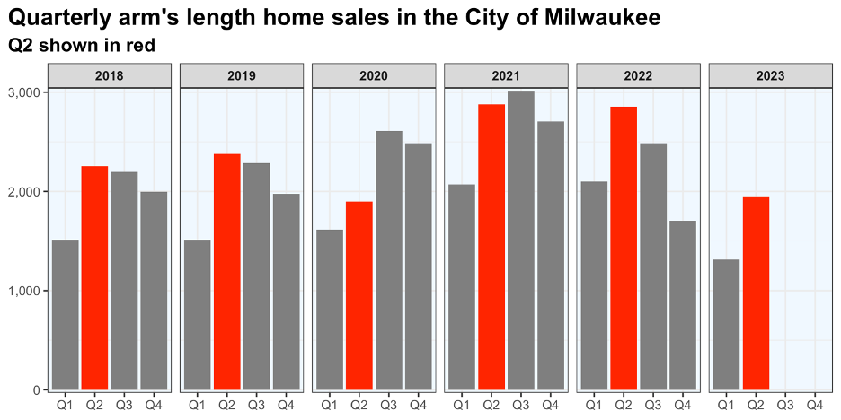
My analysis of preliminary state transaction records shows about 1,950 “arm’s length” home sales during April, May, and June of 2023. That is roughly 900 fewer than either of the past two years and close to the total sold in the second quarter of 2020, when much of the economy was still frozen by the COVID-19 pandemic.
In my last housing market report, I described first quarter home sales as falling to “pre-pandemic levels.” Now, it’s fair to say that the housing market is even cooler than that. Sales were down about 6% through the first three months of 2023 compared to 2019. That downward trend has continued, and sales in the 2nd quarter of 2023 were fully 18% lower than in 2019.
The median nominal price paid for a home during April-June has increased each year since 2019, but recent price growth has trailed inflation.
This year’s median price in the second quarter was $170,000. When adjusted for inflation to the value of the June 2023 dollar, the median price was $172,000 in 2022 and $181,000 in 2021.
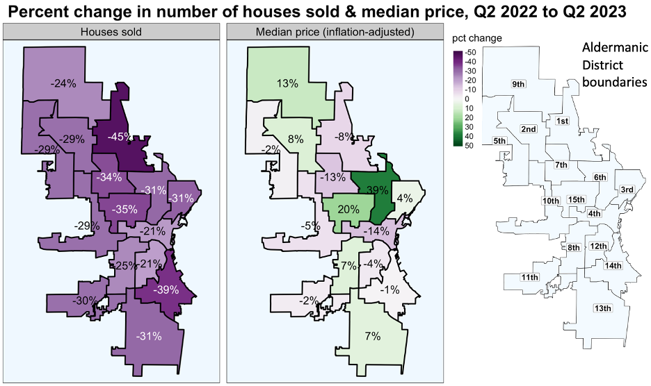
The number of home sales declined by at least a fifth in every aldermanic district over the past year. The smallest drops came in 4th district (covering downtown) and the 12th (the eastern half of the near south side). The sharpest declines occurred on in the north side’s 1st district (-45%) and the 14th district (-39%), which covers Bay View and surrounding areas.
Inflation-adjusted prices grew, year-over-year, in 7 districts and declined in 8. The greatest decline came in the 4th district, where the median price fell 14% between the 2nd quarters of 2022 and 2023. The largest proportional increase occurred in the 6th district, which includes Brewer’s Hill, Halyard Park, Harambee, and much of Riverwest. The median price jumped 39%.
As in the first quarter of this year, out-of-state landlords have switched from net buyers of Milwaukee houses to net sellers. During April, May, and June of this year, an out-of-state owner was the seller in 12% of transactions and the buyer in just 7%. A year ago, the relationship moved in the other direction, as owners outside Wisconsin bought 15% of transacted houses and sold 9%.
The behavior of Milwaukee’s out-of-state, private-equity backed landlords gives some insight into this change. After several years of rapid acquisitions, VineBrook Homes and SFR3 have both switched to selling Milwaukee houses. Transaction records show that VineBrook sold 20 houses during April, May, and June of this year. SFR3 sold 18, and neither company purchased any.
Data collected through mid-May showed that VineBrook was generally losing money on sales in 2023, while SFR3 was selling houses for far more than they originally paid. The rest of the 2nd quarter did not alter that finding.
I was able to make direct comparisons between the original purchase and final sale prices in 17 VineBrook transactions during April, May, and June. Records show that the company sold the houses for $1,267,500 collectively, after buying them for $1,326,140. That is a loss of $58,640, or 4.4%, not including any other expenses beyond the purchase price.
I likewise identified comparable acquisition records for 16 of SFR3’s 2023 second quarter sales. Collectively, SFR3 sold these houses for $2,671,800 after buying them for $1,274,009—a profit of $1,397,791, or 101% before additional expenses.
Flippers remained active in the market. The most prolific, Rentalvest LLC, bought 17 houses and sold 12, according to state transaction records. California-based Ace Property Acquisitions LLC bought 15 and sold 16. Smart Home Solutions LLC bought 9 and sold 10.
After several years of rapid owner-occupancy growth, homebuyer activity has cooled, but the trend remains positive. Through the first half of the year, parcel records indicate that the city has enjoyed a net increase of slightly more than 200 owner-occupiers.
A note on data
The statistics in this article are derived from a custom dataset matching state transaction records with city parcel data. Due to delays in the reporting process, the 2023 statistics are preliminary, and the final totals will likely be slightly higher than at present. About 1.5% of transactions could not be matched and are not included in this analysis.