Prof. Merrill’s Hallows Lecture on How Implicit Legal Ideas Have Deformed the Constitution
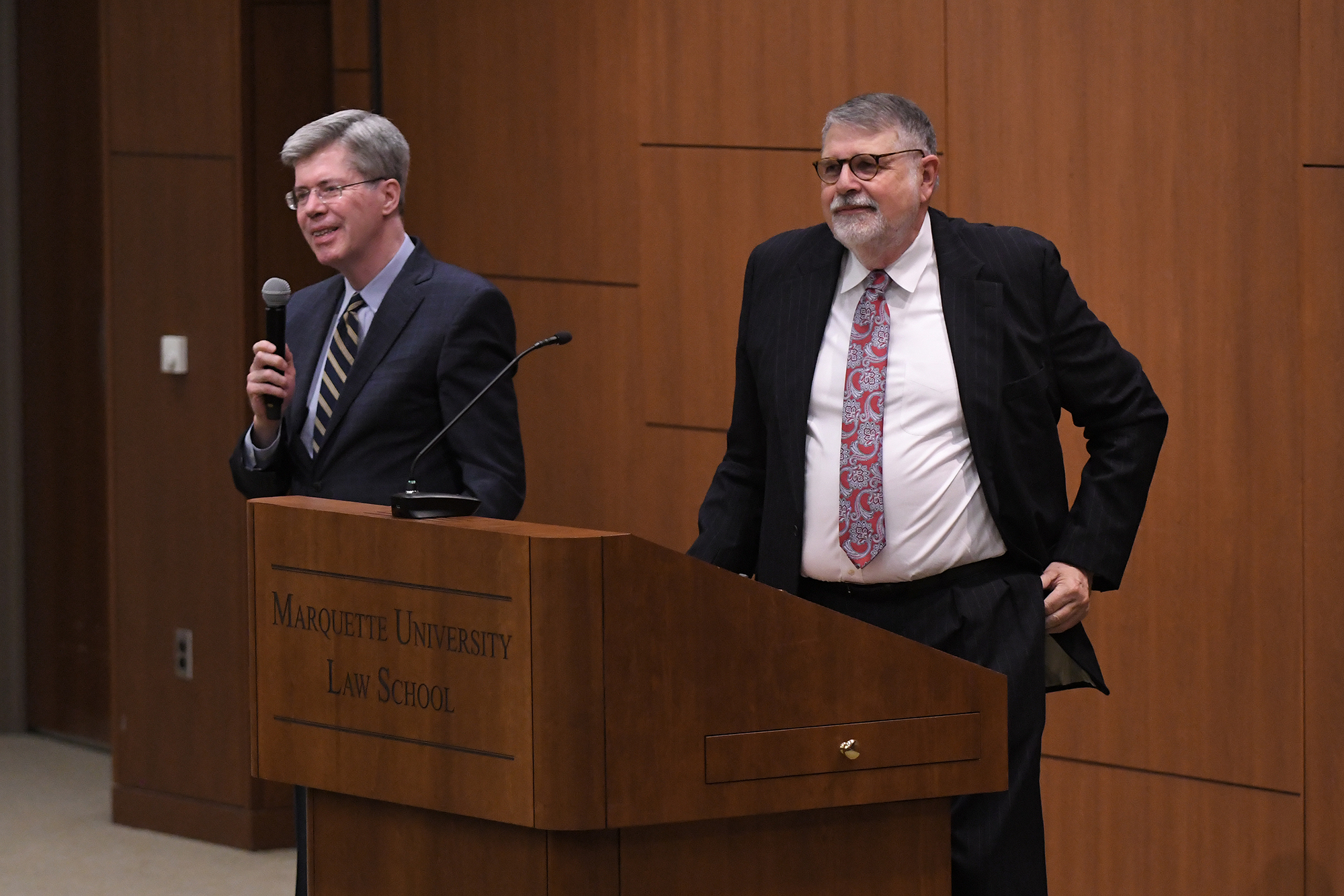
The Law School had the privilege earlier this week to present our annual Hallows Lecture. The occasion remembers E. Harold Hallows, a Milwaukee lawyer who taught part-time at Marquette Law School during 1930–1958 and then served on the Wisconsin Supreme Court from 1958 until his death in 1974, the last six years as chief justice. For the lecture, we welcomed Thomas W. Merrill, the Charles Evans Hughes Professor of Law at Columbia University, one of the nation’s most widely respected legal scholars.
Prof. Merrill’s Hallows Lecture, delivered on March 2 in the Lubar Center before 200 people (we counted), was rather a tour de force. Here were the title and advance description:
“Unstated”: How Three Implicit Legal Ideas Have Sidelined Congress and Empowered the President and the Courts
Why has Congress, the constitutional keystone of the federal government, become so ineffective, relative to the president and the federal judiciary? While many explanations have been offered, one important but unappreciated reason is legal ideas—not just widely discussed concepts such as the unitary executive and originalist interpretation of the Constitution but also, and perhaps even more importantly, unstated ideas that have taken hold without much explicit discussion or acknowledgment. This lecture will identify and discuss three largely unquestioned ideas that have combined to deform our constitutional regime. Their result has been that the president wields immense power in the guise of issuing orders and binding regulations and the courts exercise great power in the guise of interpreting the Constitution and laws, while Congress stands largely out of the picture. While there is no magic incantation for restoring a proper constitutional balance, an important first step is to recognize the role that unstated ideas have played in the transformation, so that they can be unmasked and debated in the open.
Even in advance of its publication this coming fall in the Marquette Law Review and Marquette Lawyer, Professor Merrill serialized the lecture this week for a national audience on the Volokh Conspiracy blog. Following an introductory post by Professor Eugene Volokh, the blog featured the following posts the past four days, March 2–5:
- How Unstated Legal Ideas Have Deformed the Constitution
- The “Unitary Executive” Theory’s Contribution to the Deformation of the Constitution
- The Role of Delegation Theories in Deforming the Constitution
- How the Supreme Court’s Conception of Its Role Contributes to the Deformation of the Constitution
The text of the entire lecture as prepared for presentation can be read here, and a video of the lecture is available to view here.